

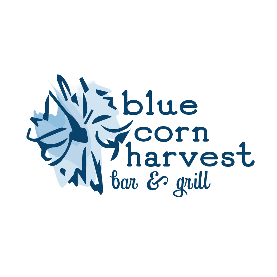
In this school project, we were supposed to select a local restaurant that has what we consider a lackluster logo and recreate it. I chose the Central Texas restaurant Blue Corn Harvest. Their current logo features a low-transparency image of blue corn with their name over it in the font Papyrus. I have a strong dislike for that font and the use of real images being used in that manner, so it felt like a good contender for me. In our research, we were required to go to the restaurant and eat there to feel the atmosphere and understand our target audience. The location I went to felt very down-home country, somewhere you would go to have comfort food. The interior decorating felt like the farm aisle at Hobby Lobby threw up on the walls. With this information, I knew I needed to keep the corn imagery intact somehow.
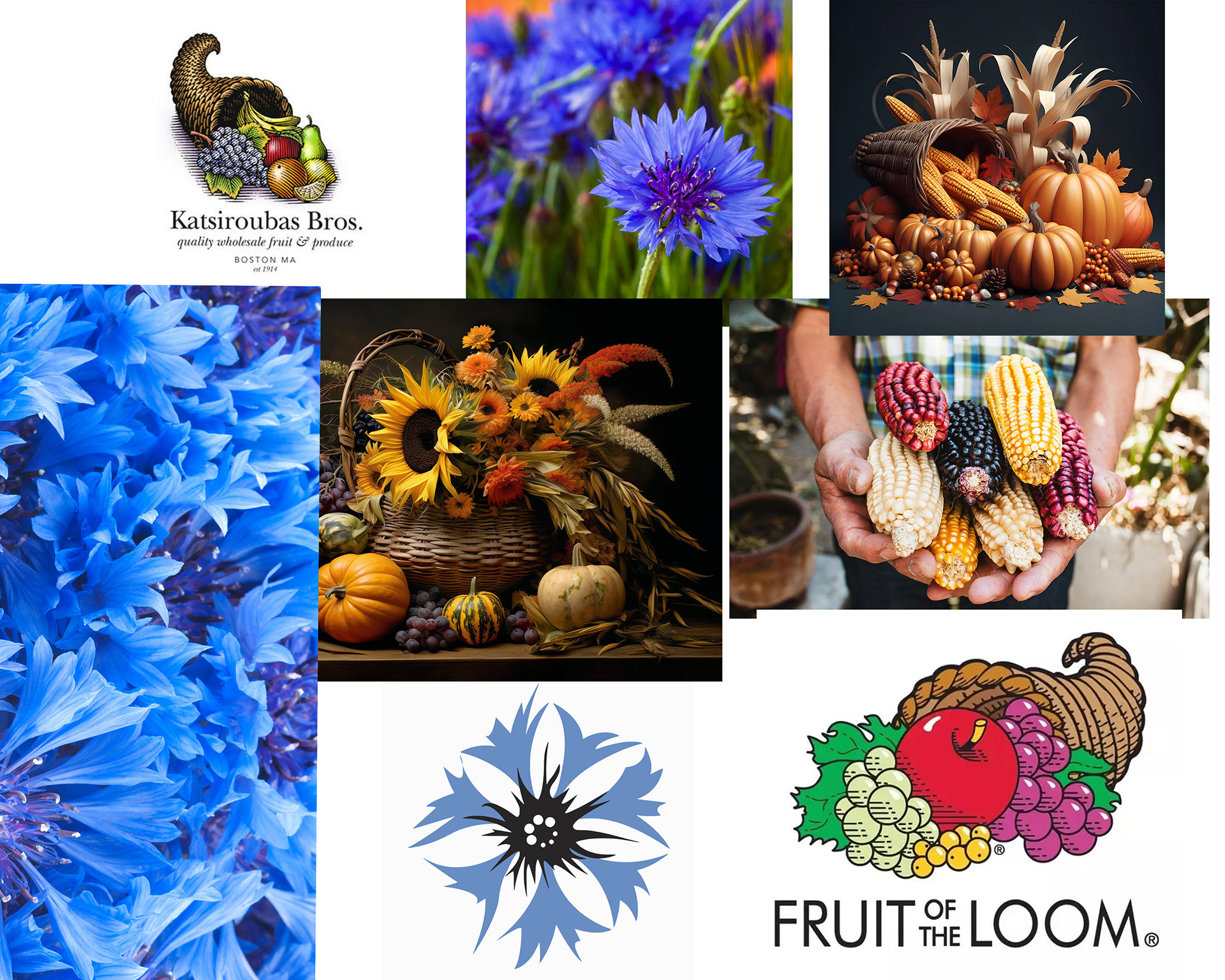
Moodboard
After considering multiple concepts and moodboards, I decided to move in a more nature-driven direction, with cornflowers and vegetables to give a literal representation of the brand.
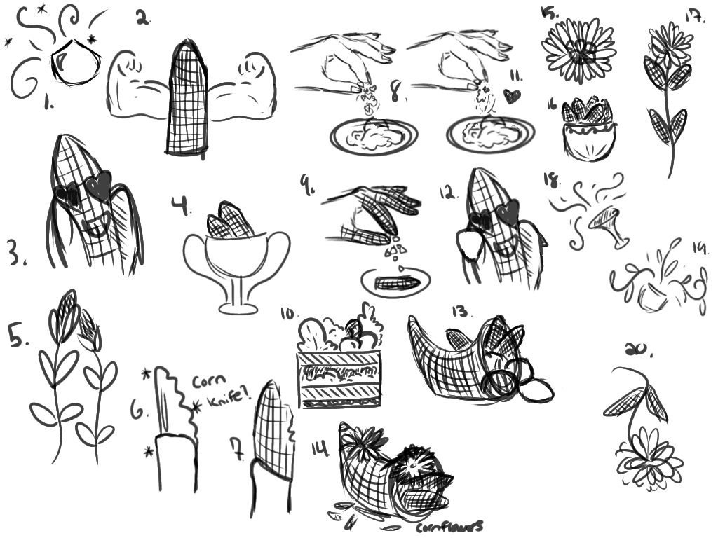
Sketches
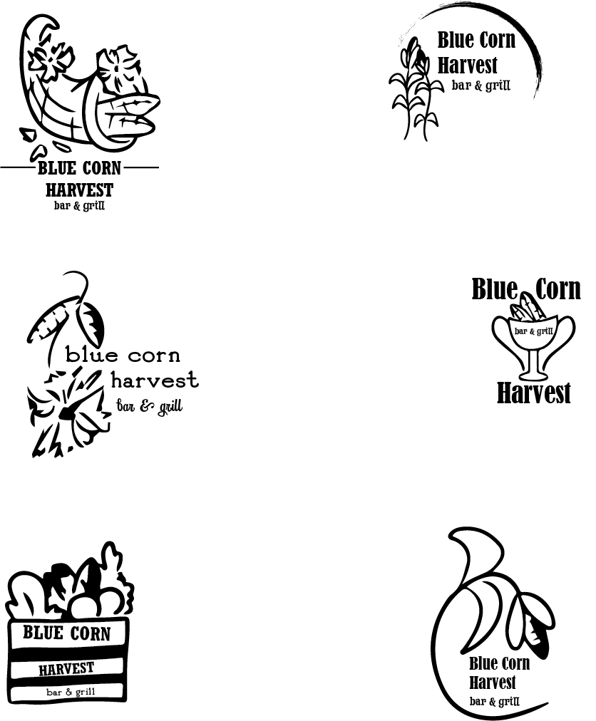
Most of my sketches revolved around corn, and I tried mixing cornflower with actual corn stalks, using the ears as leaves. I also put the corn and flowers inside a cornucopia, for cornception. I also tried to make the ears of corn smile, but I think that would come off as a little too corny.
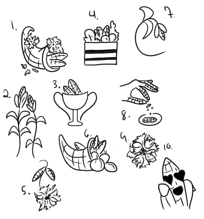
I took my 10 favorite sketches and cleaned up the lines on them, further refining them and the ideas behind it.
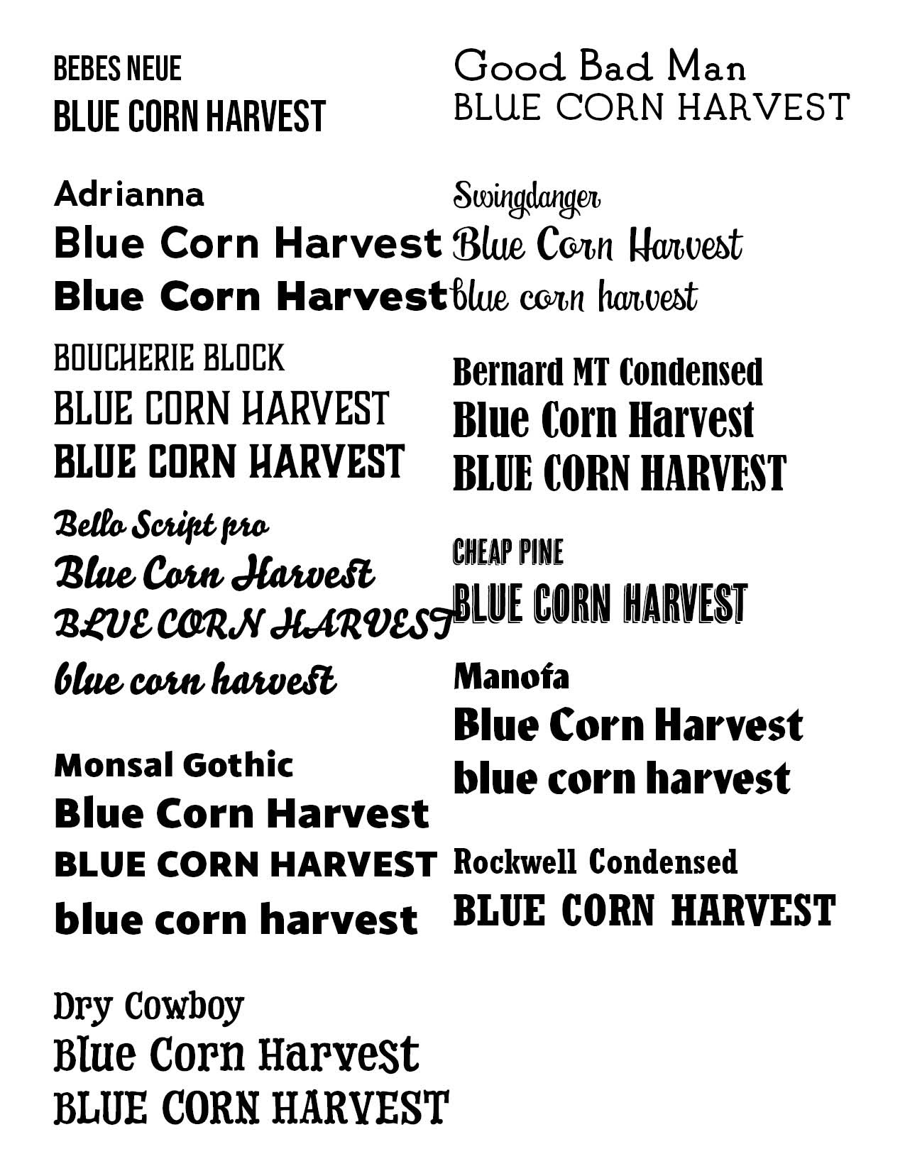
Type Study
Alongside working on the sketches, I also worked on selecting what typefaces I wanted to use in my logo lockup. I was leaning towards some more Hollywood Western fonts, because this is a local restaurant in Central Texas. Fonts such as Dry Cowboy, Good Man Bad, and Swingdancer were top contenders because they fit the bill for what I was looking for.
Digital Drafts
I took the 6 best sketches from the refined ones and created type lockups with them. The 3 that I decided not to move forward with felt blatantly obvious at this stage, as the first 3 had far superior hierarchy.
Color Study
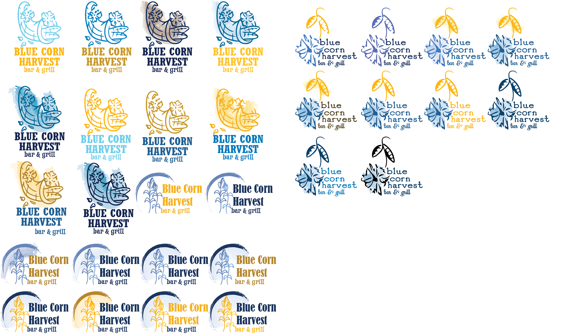
With the best 3, I created many color versions of all of them. This was particularly difficult because I was limited to using Pantone colors only, so finding blues and golds that go together proved to be a challenge. I wanted the style to be less clean on the coloring, so I used watercolor blotches to just provide a general overlay on the imagery. I wanted to feature the gold because that is typically the color of corn, but I did not end up liking any of them; the contrast just didn't seem to work.
First Direction
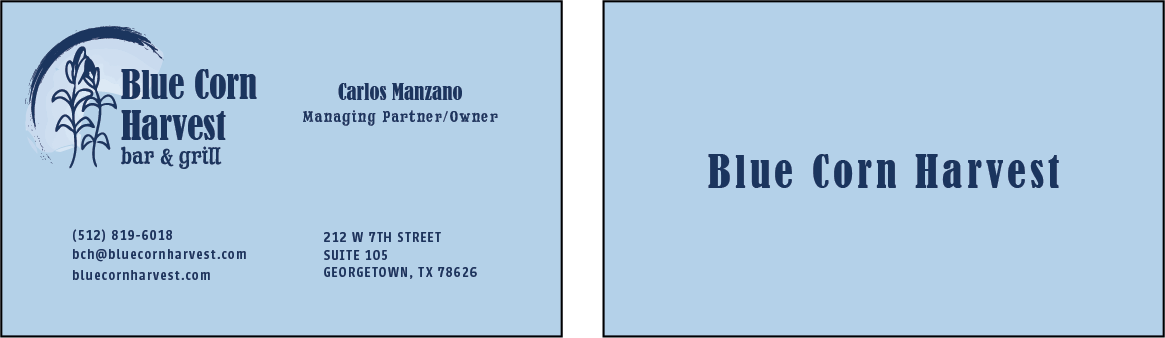
Initially, I had selected the corn and moon logo to be my final version and even created the business card to feature this one, but after feedback from multiple people saying they could not tell that this was supposed to represent a harvest moon and that my cornflower logo had more potential, I decided to rework it.
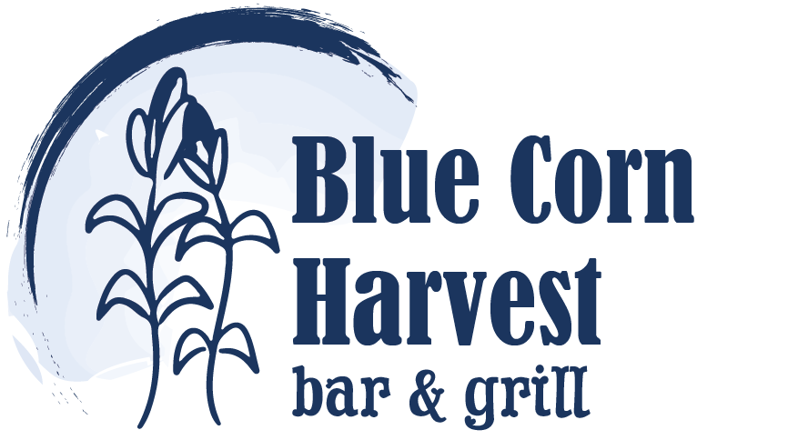

Final
The only thing throwing me off about the cornflower was the large stem extending upward, creating a very unbalanced feel. The leaves of the flower were supposed to be literal heads of corn to tie in more of that element but in the end I decided that allusion was unnecessary. I chose these colors from the initial color study I did and seeing it without the stem in those colors creates a very leading logo.
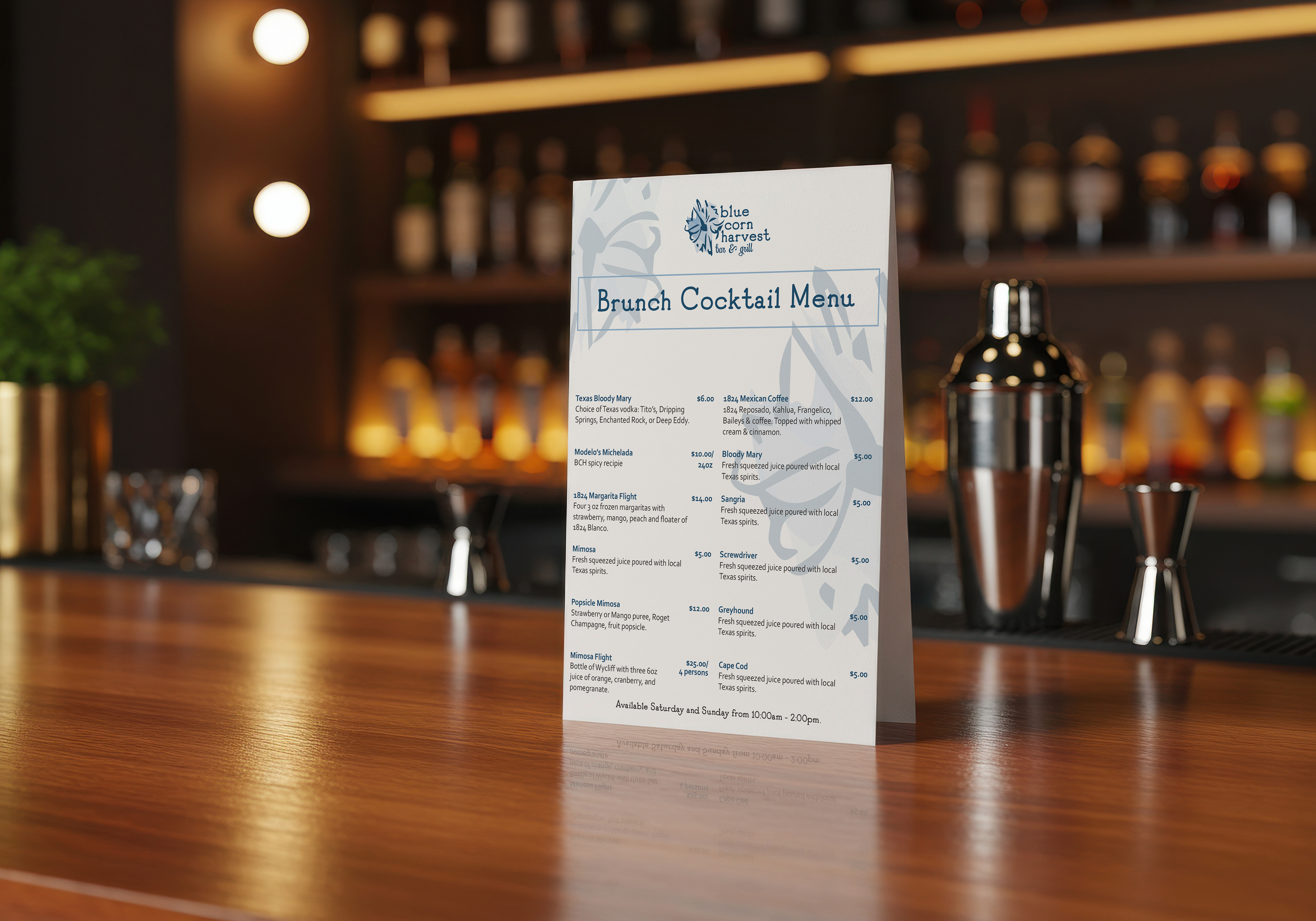
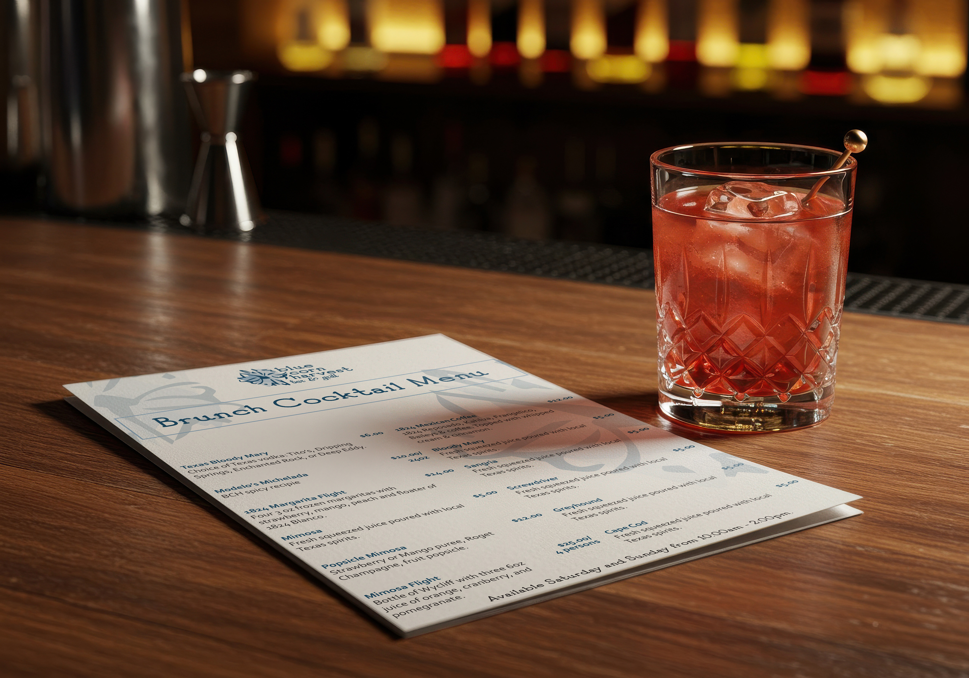
In addition to the logo, I also created a cocktail menu for the drinks they serve at brunch on the weekend. I used the cornflower as a background element to add visual interest rather than just having a blank white background, and used the same blue color as the logo for all of the type.
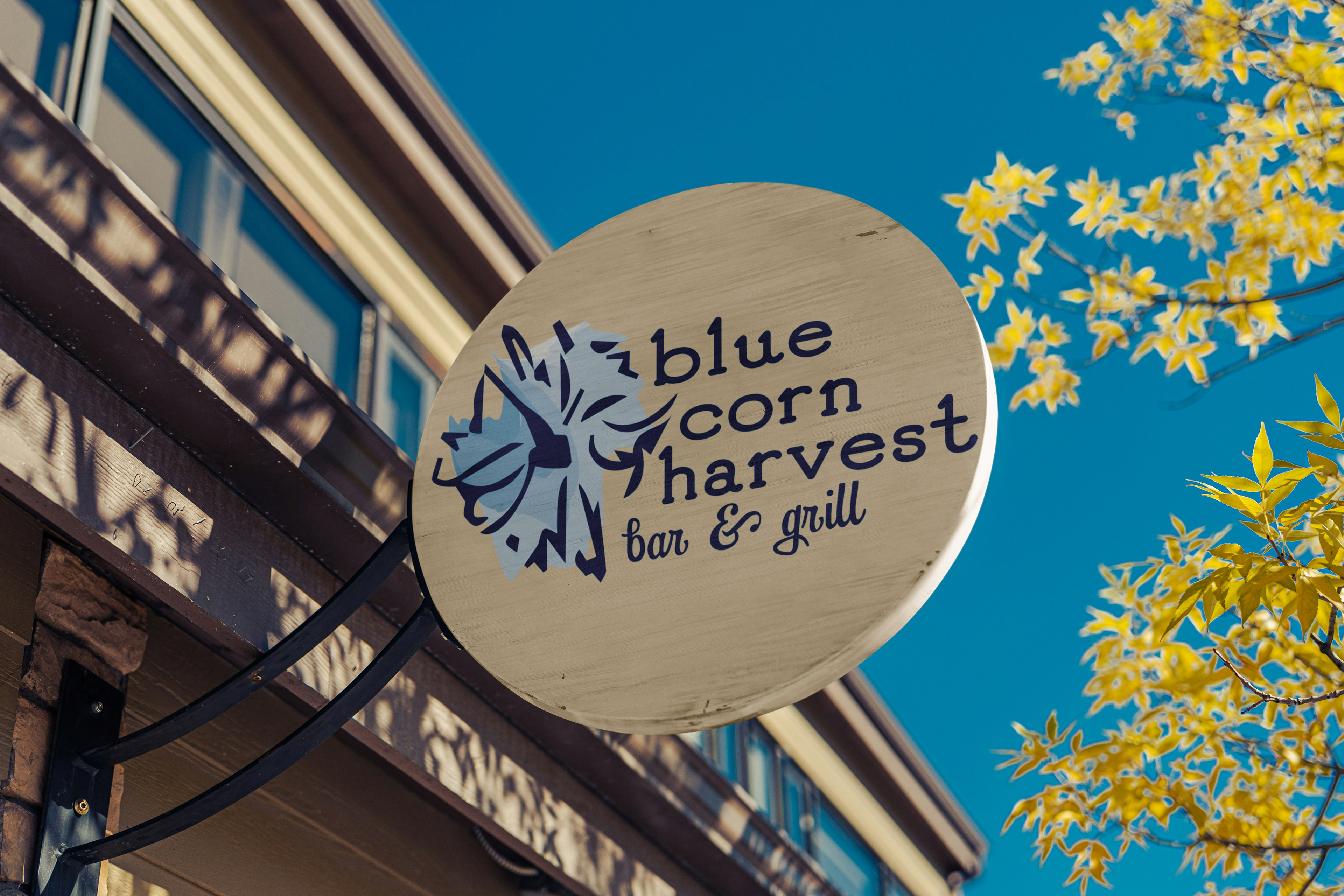
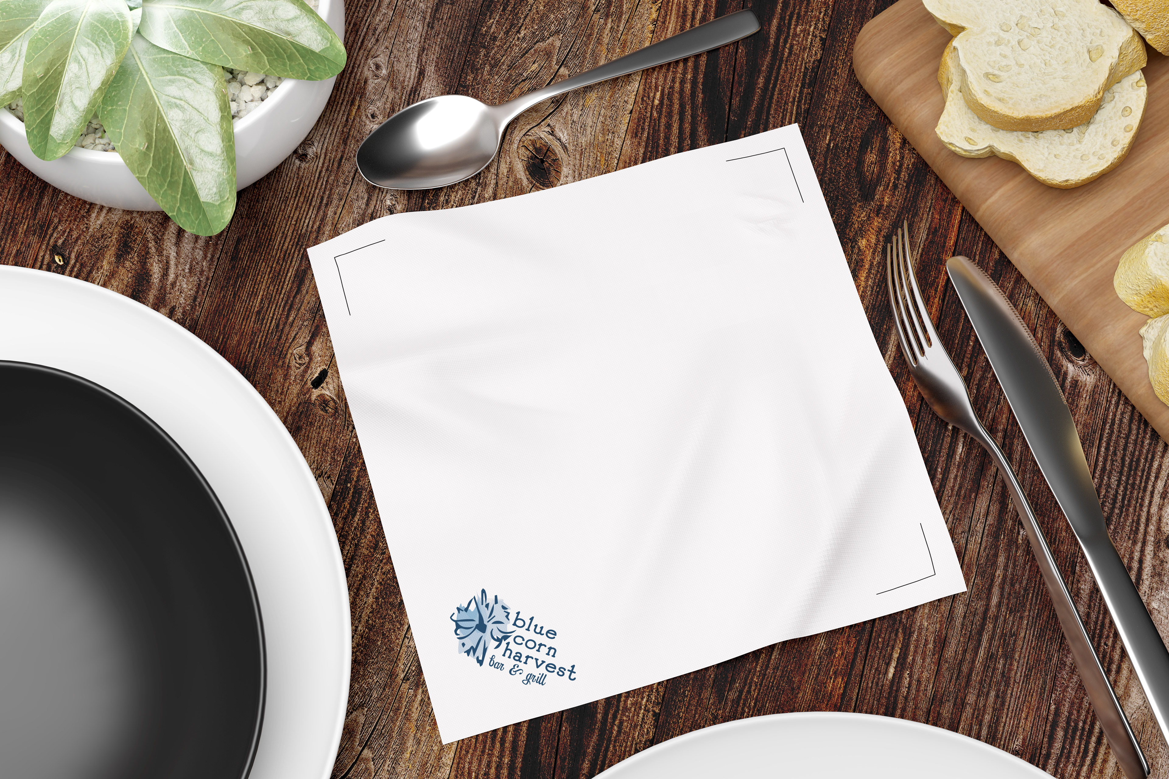
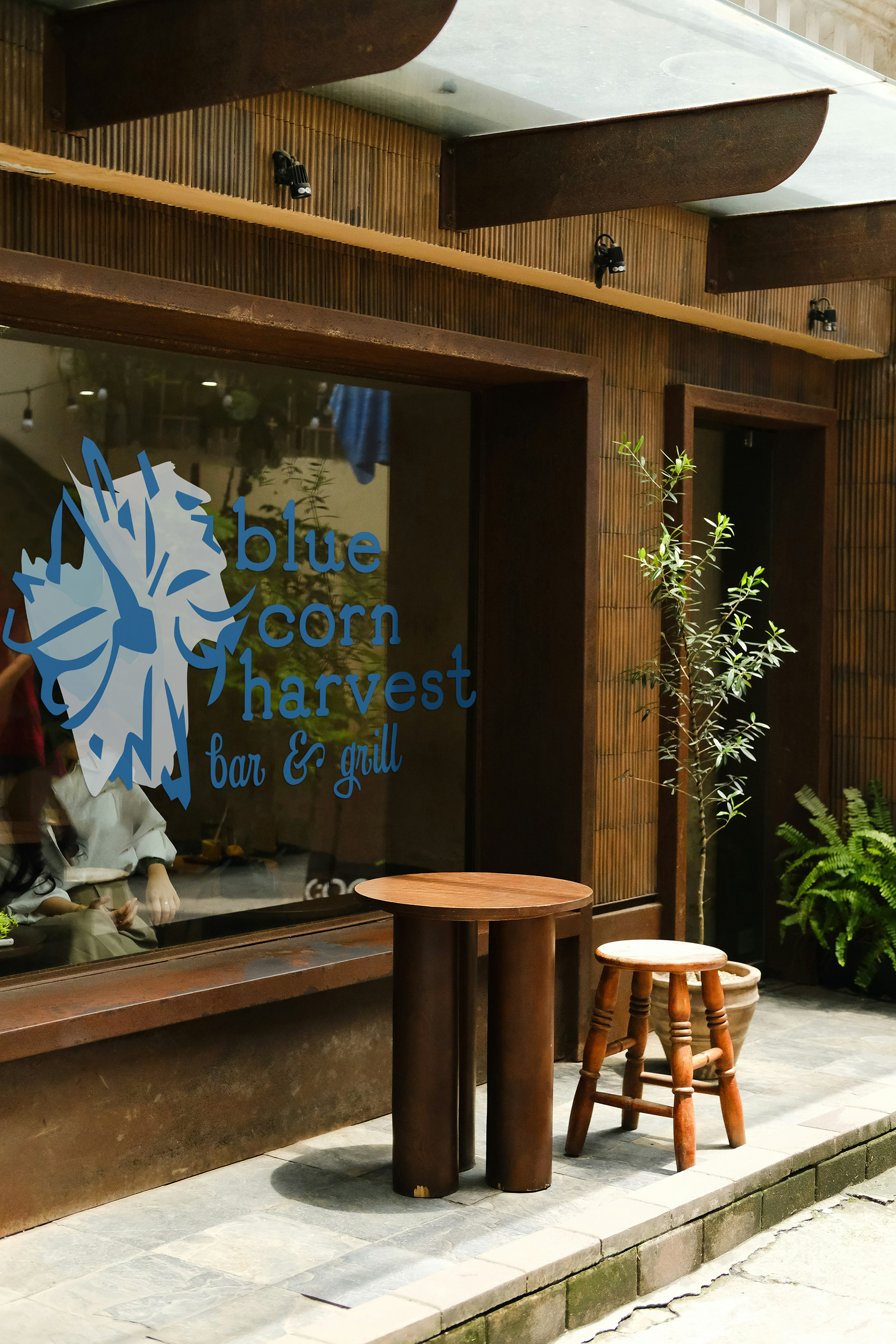
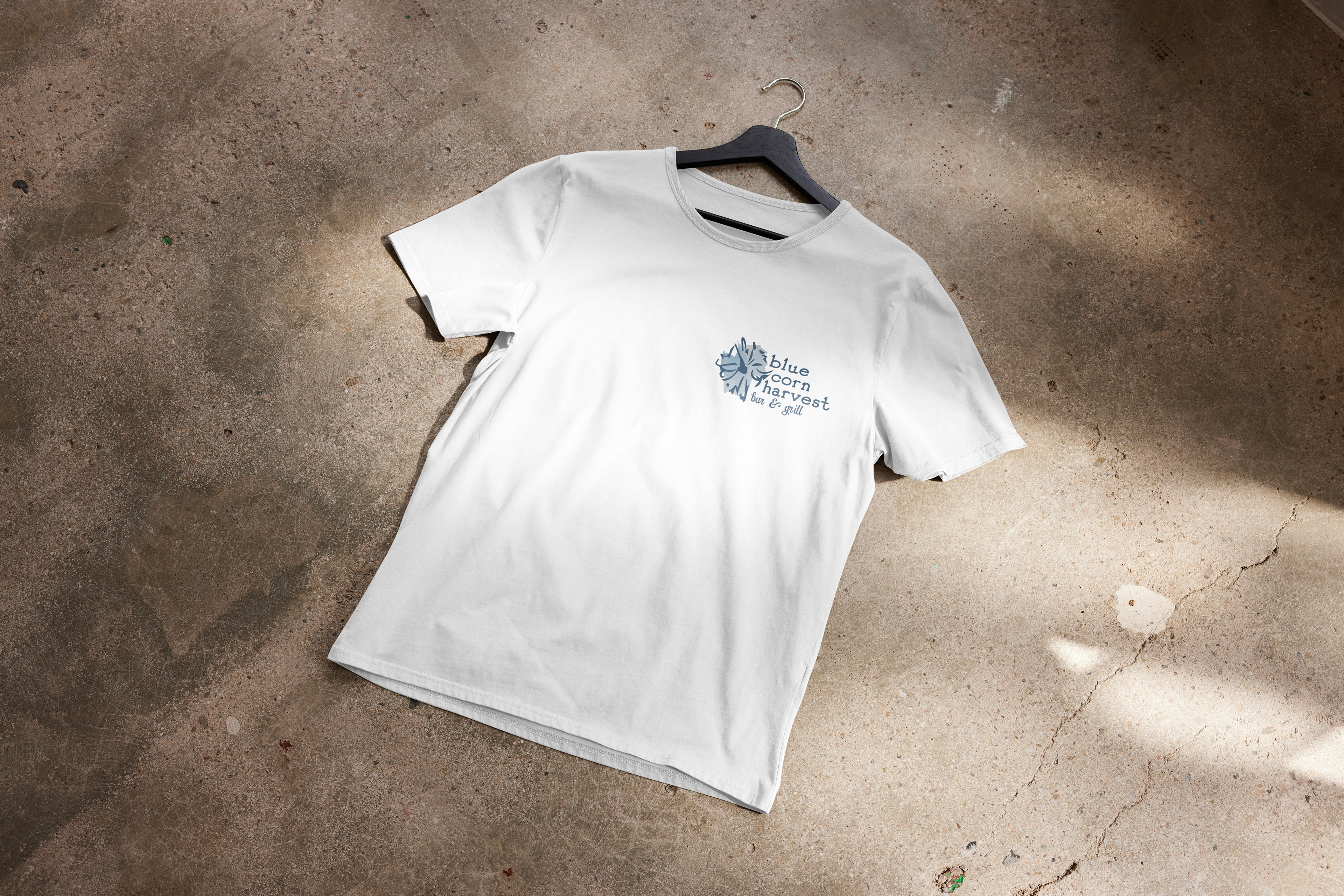
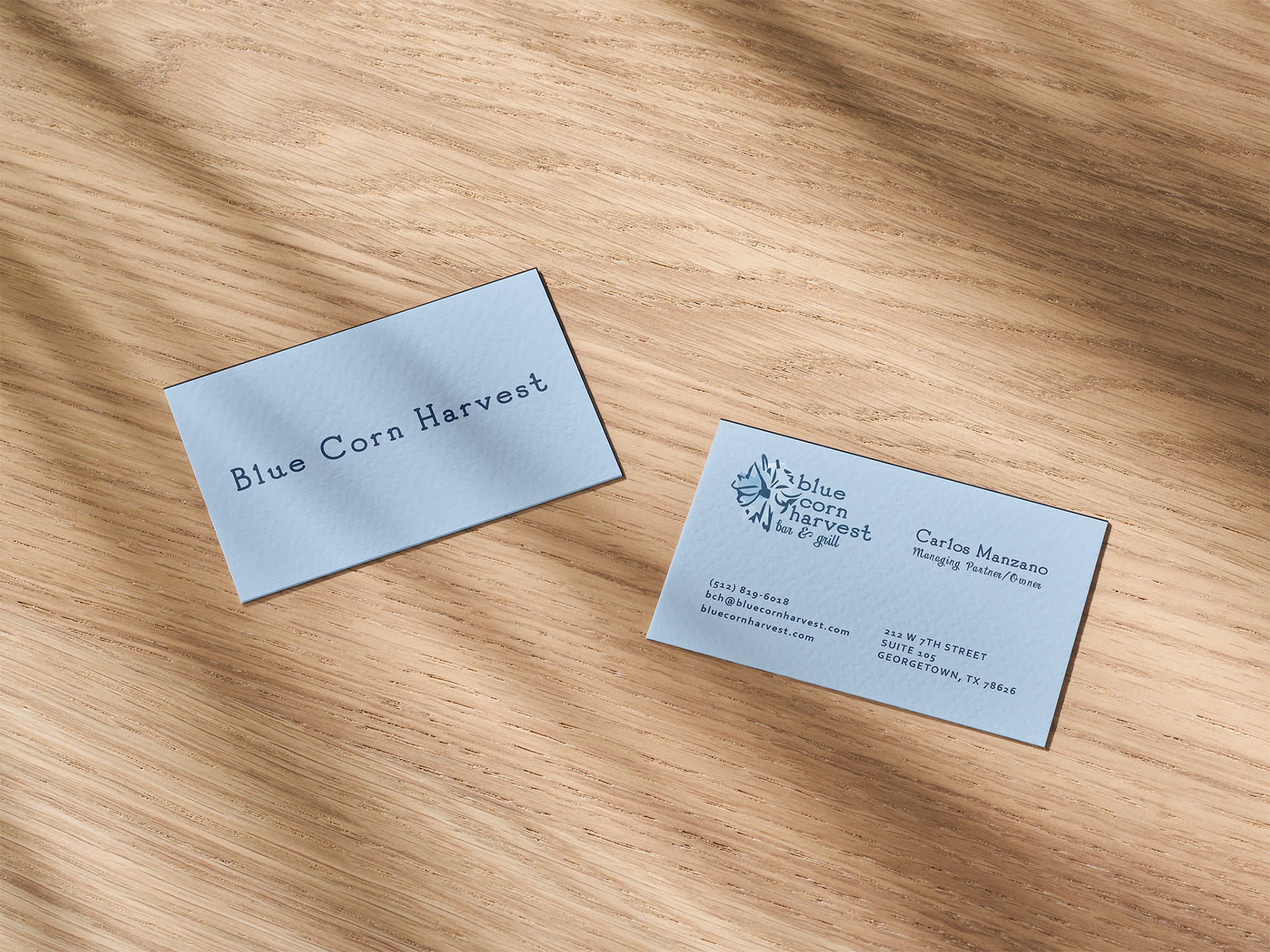
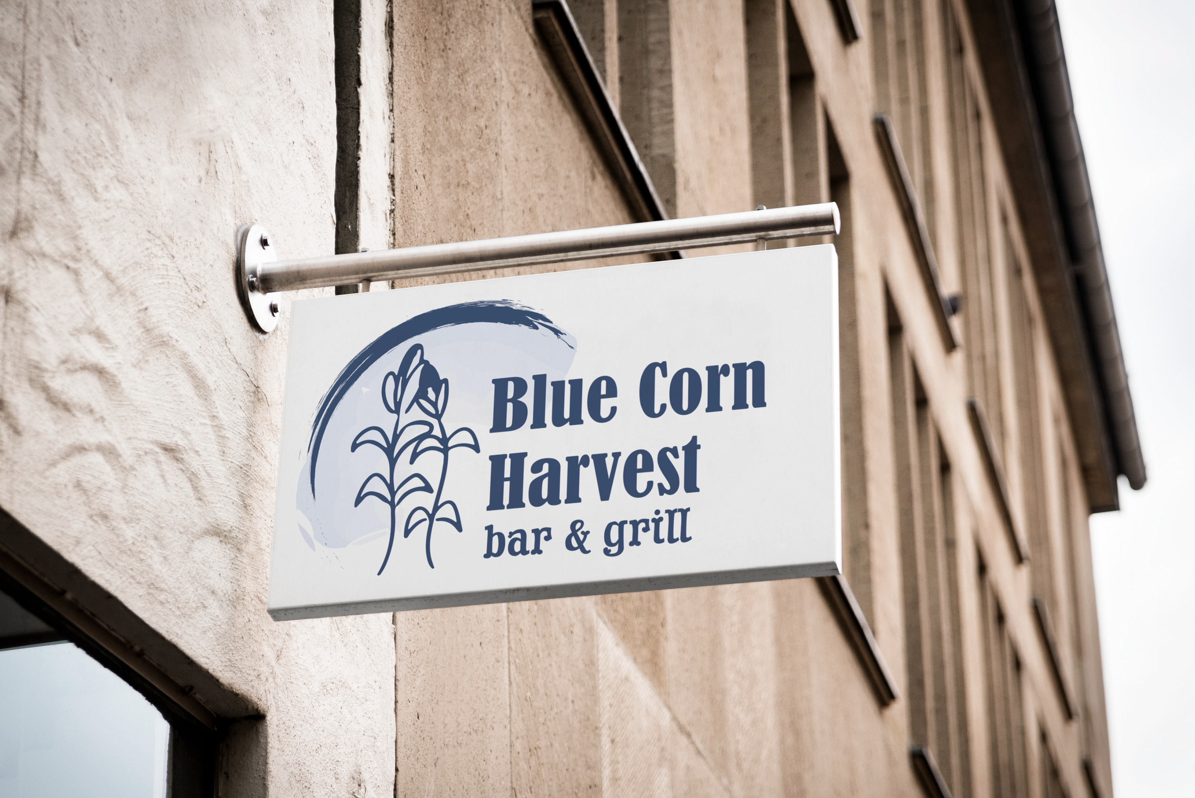
These are all of the final mockups with the logo. A glass storefront and round sign, as well as a simple T-shirt the staff would wear, and a napkin that might be found at the bar. The only change I made to the business card was swapping out the logo and the fonts to be consistent.