This school project is about creating a campaign for a city of your choice. It must include a logo, brochure, website, Instagram posts, and 3D touchpoints. I chose the city of Kingman, which is a medium-sized city in Arizona.
Moodboard
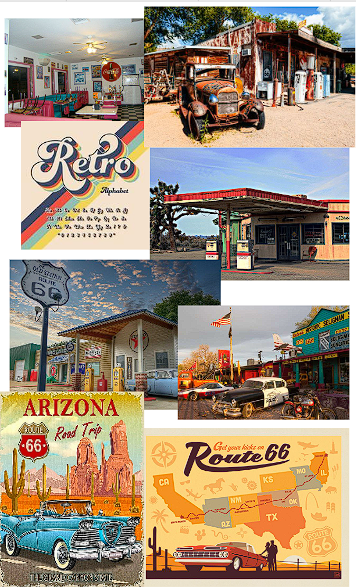
Because Kingman is located along Route 66, I wanted to lean into a retro desert vibe. I pulled imagery of old rusted gas stations and classic cars to set the tone. A groovy 70s-style font and bright colors also helped reinforce the look I was going for.
Sketches
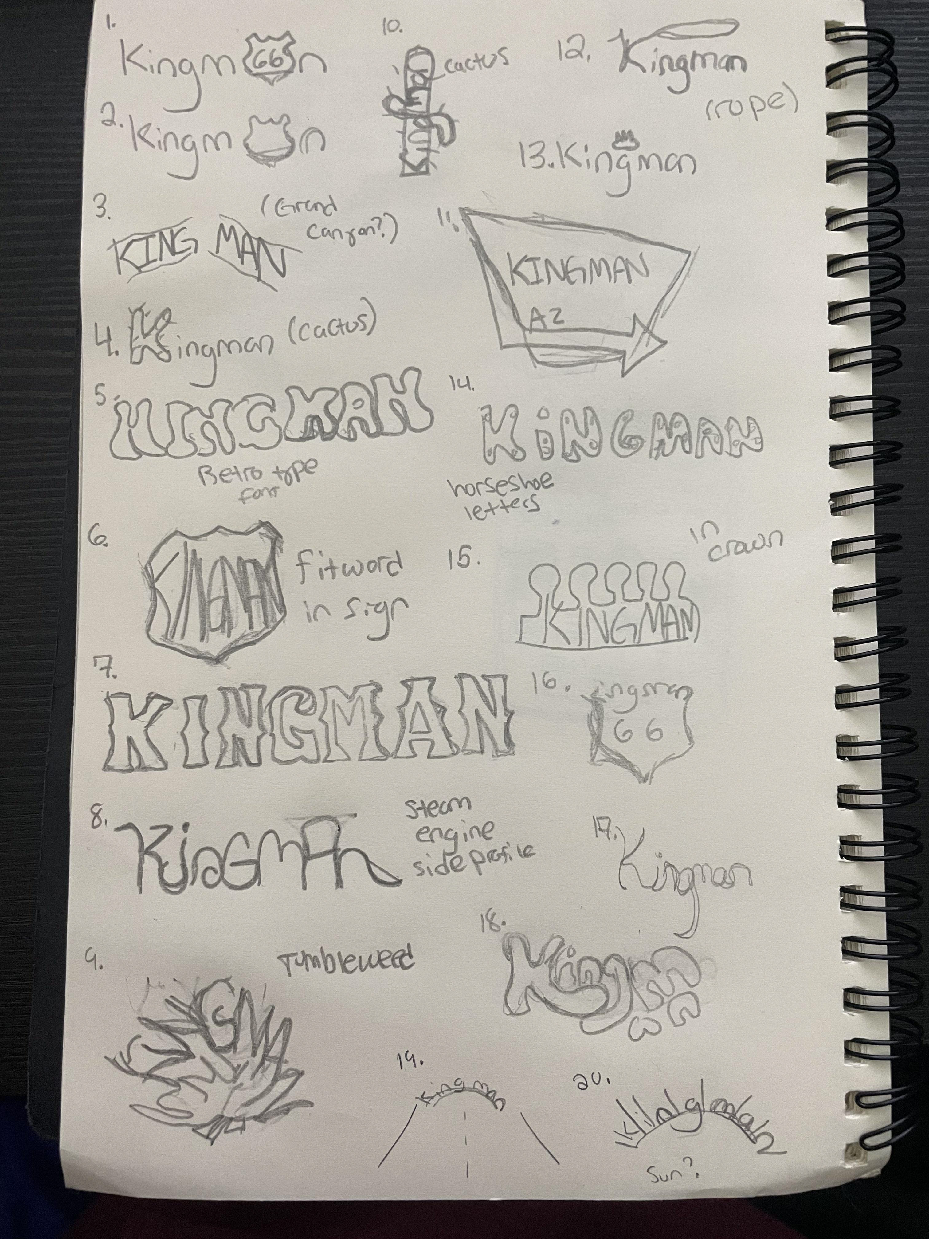
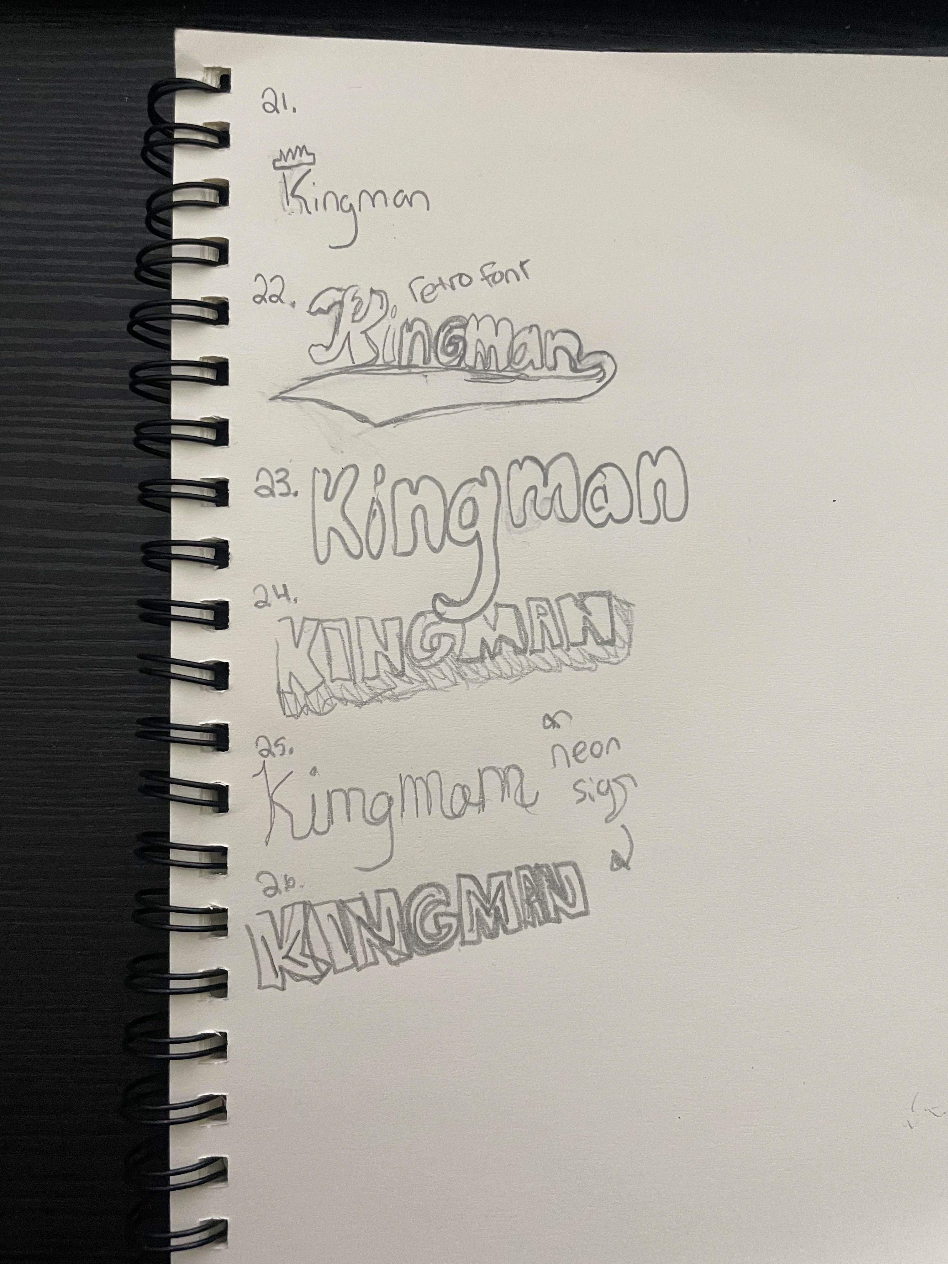
I wanted to incorporate those retro vibes into the logo while still keeping a clear desert influence. I used imagery commonly associated with the desert, like a cactus, the Route 66 crest, and a lasso. I also played around with neon sign style concepts to mimic old motel signage. On the more literal side, I explored a few crown-based logo ideas as well.
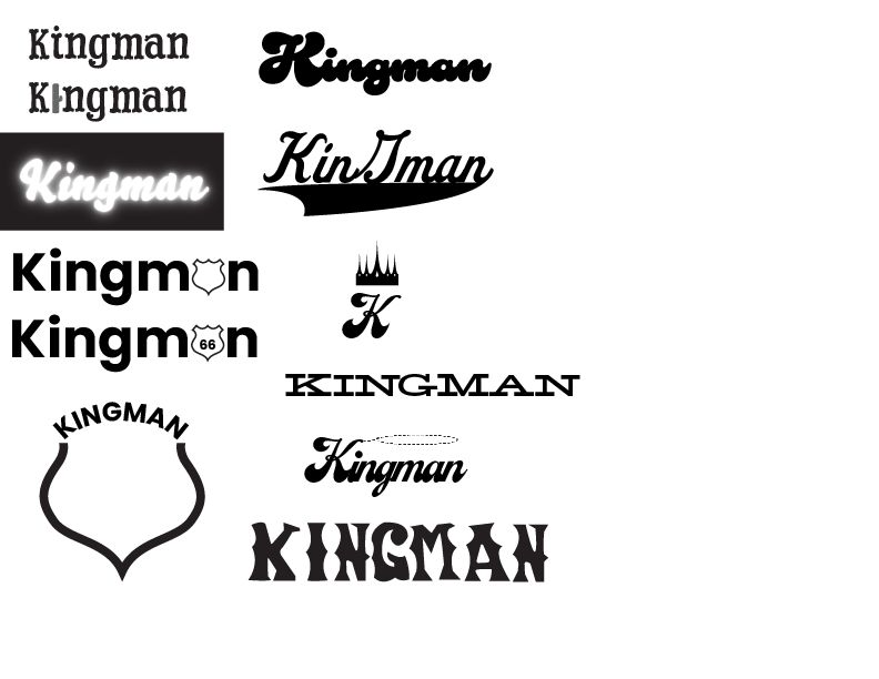
I moved onto digital drafts to try and find a font that suited my needs. I tried to make the imagery in these more subtle, like having a cactus just be the "i" or having the Route 66 crest just replace a letter.
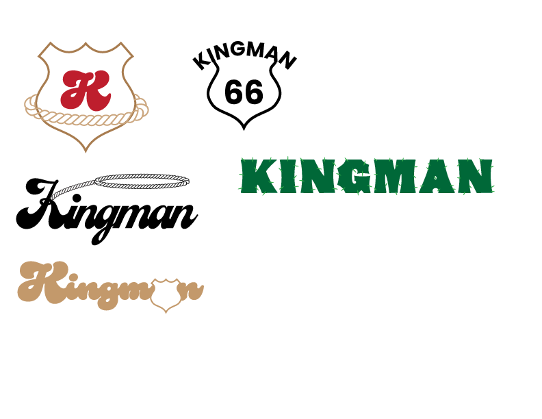
In my second logo drafts I narrowed it down further to just a couple things, maining using the crest in some form or fashion. I was leaning towards this specific retro font that fit the vibe of what I wanted really well, and I found that putting the crest around the "a" worked pretty well. In my color study with the logo I ended up taking the tail off the "a" so it would fit nicer inside the crest, which is shown in the bottom example.
Second logo drafts
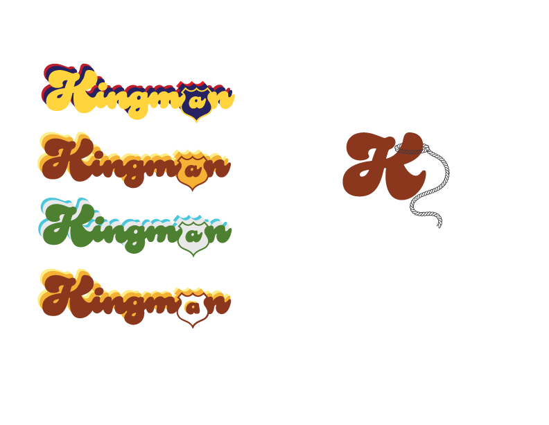
Color study
Brochure
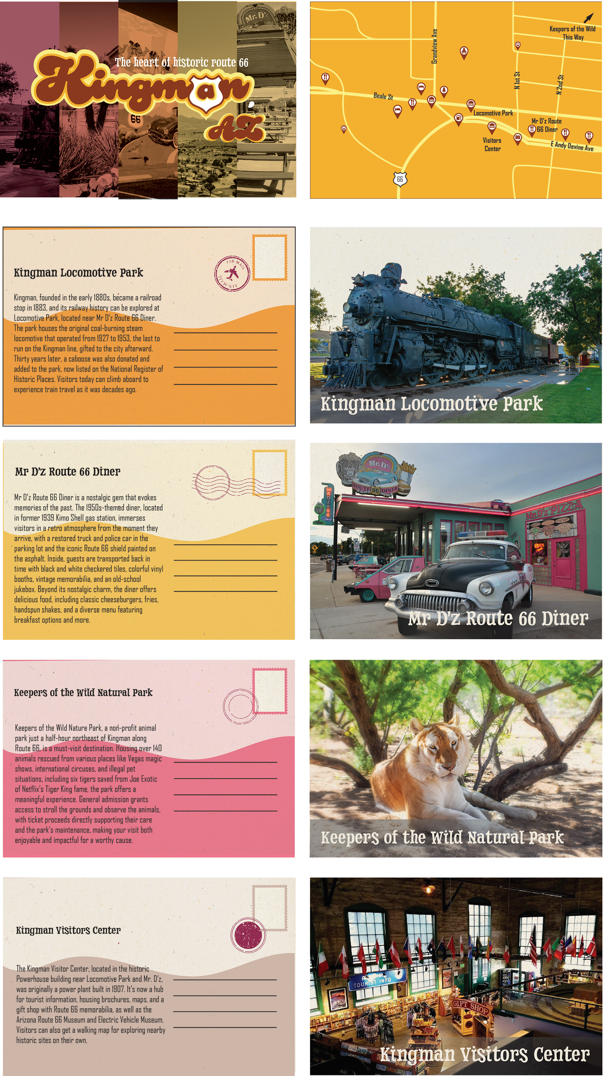
For my brochure, I did not want it to be something traditional that unfolds into a giant, inconvenient piece of paper. I had 2 ideas, one that is in a small square and flips out into pieces, or multiple small cards being held together with a ring.
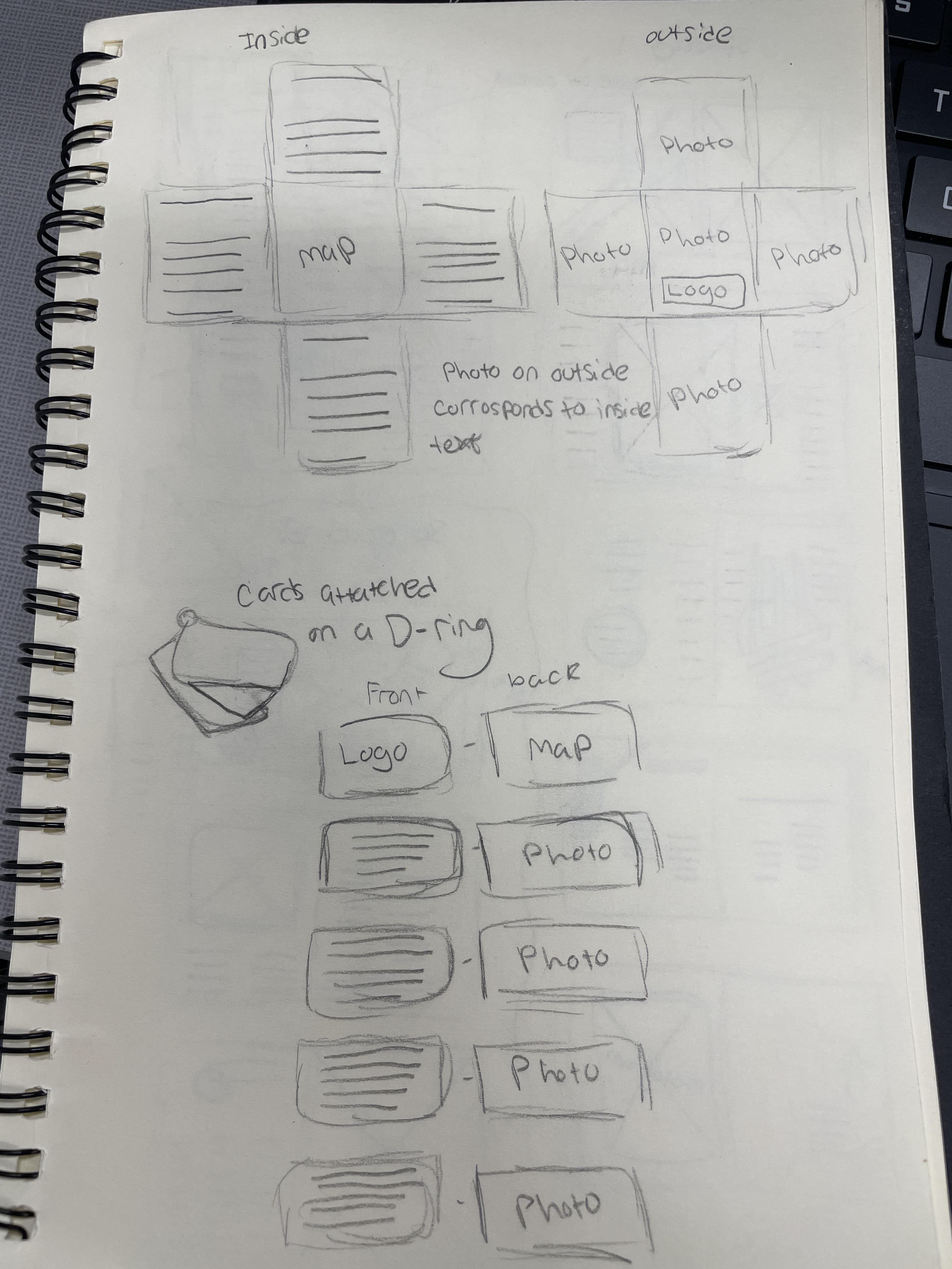
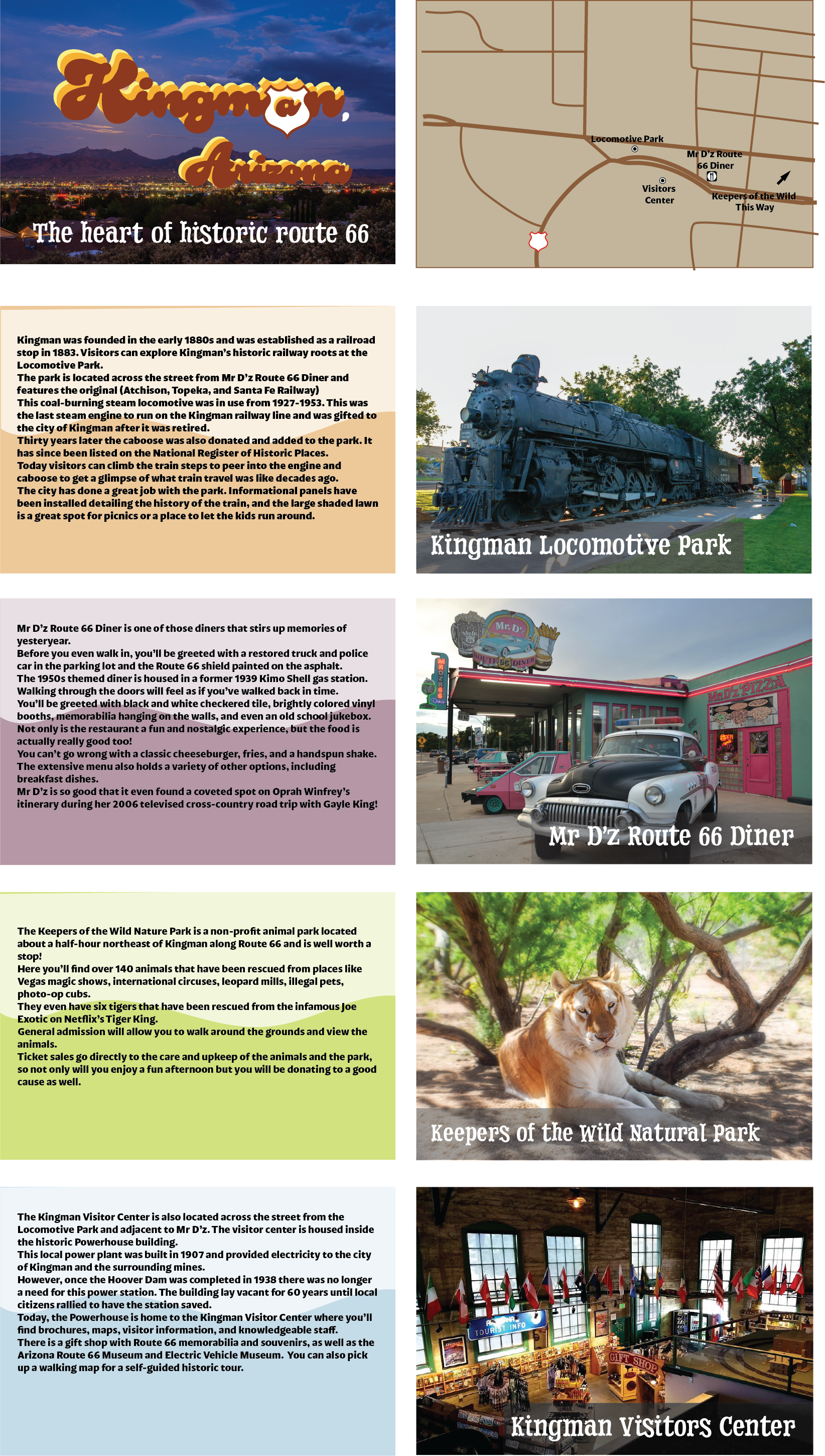
I decided to go with the cards on the ring. The back of each card would be an image of some attraction in Kingman, and the front would have a description of text about said place. The top card just has the logo on one side and a map on the other, showing where the different places are contained in the brochure. The header font im using resembles bones, to tie in the desert vibes.
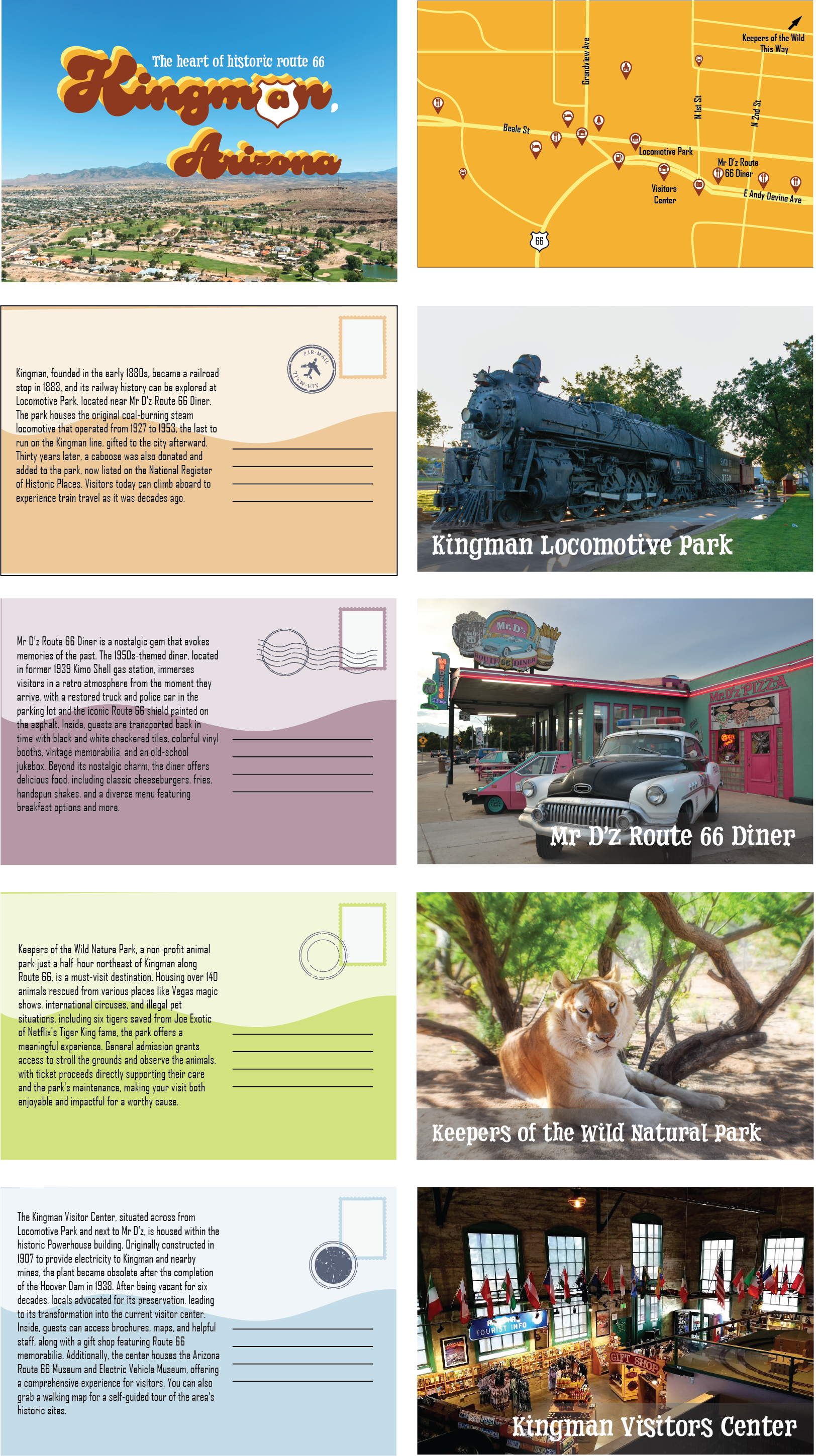
After some revisions, I decided significantly shorten the text portion and turn them into post cards. The idea is that these cards can actually be sent to someone, to show off where you've been and what you did. I made the map in the colors of the logo and added some more icons that represent different places, such as resturants or hotels.
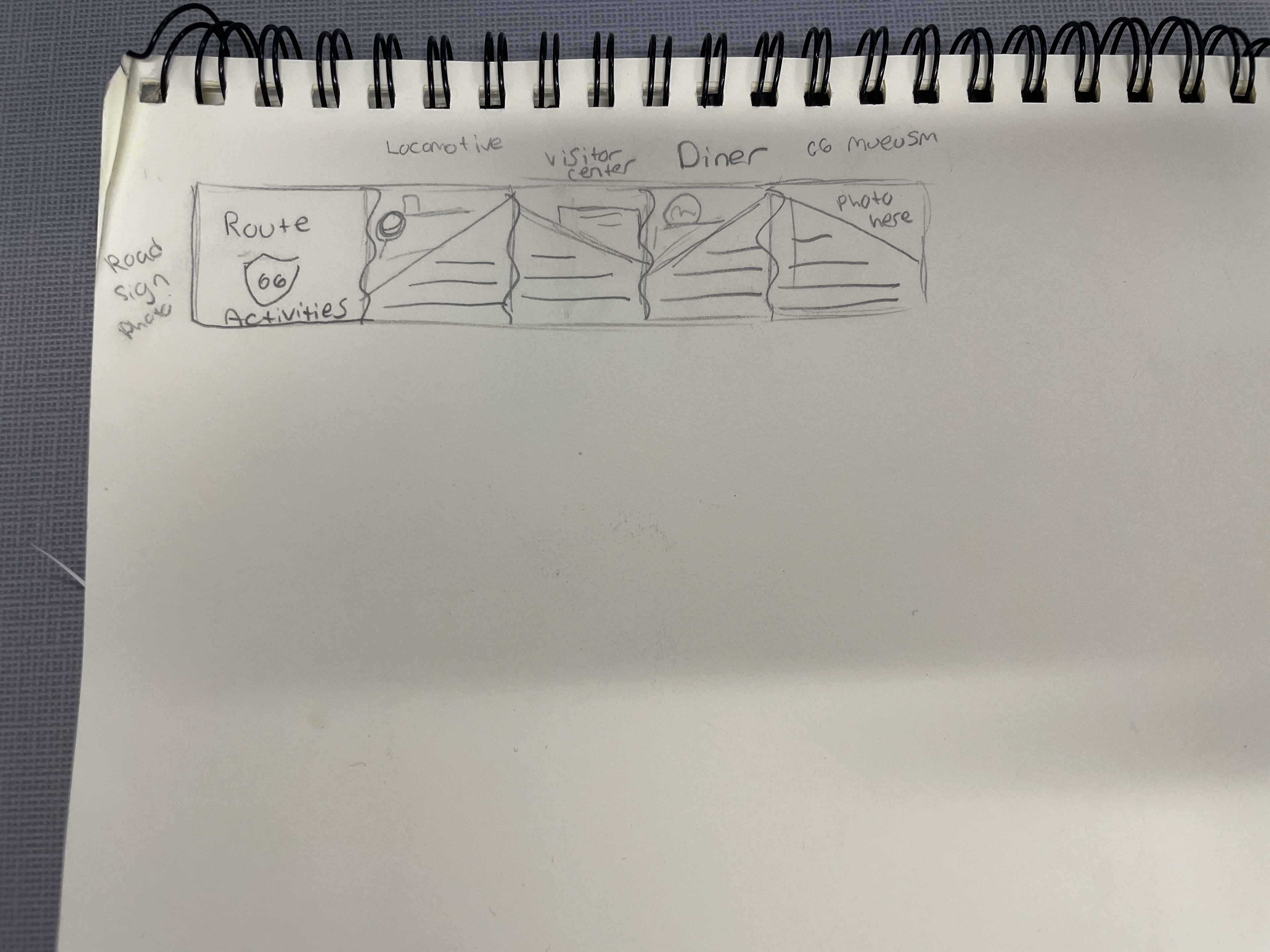
Wireframe
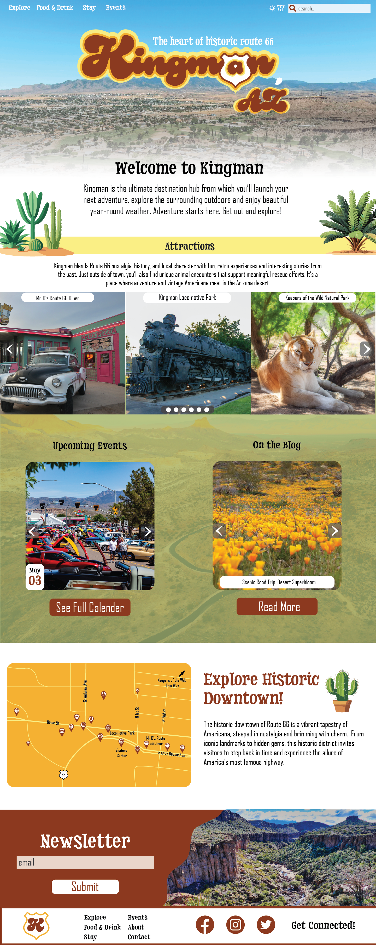
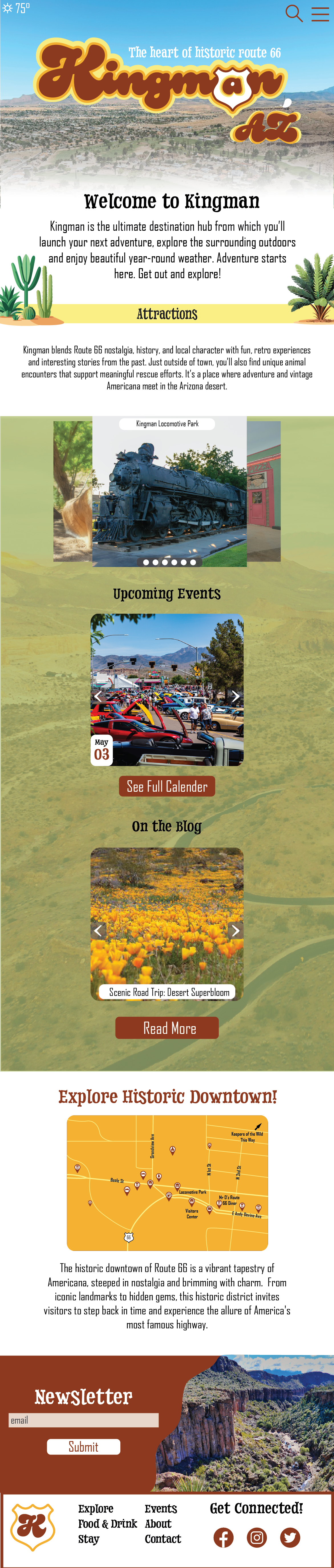
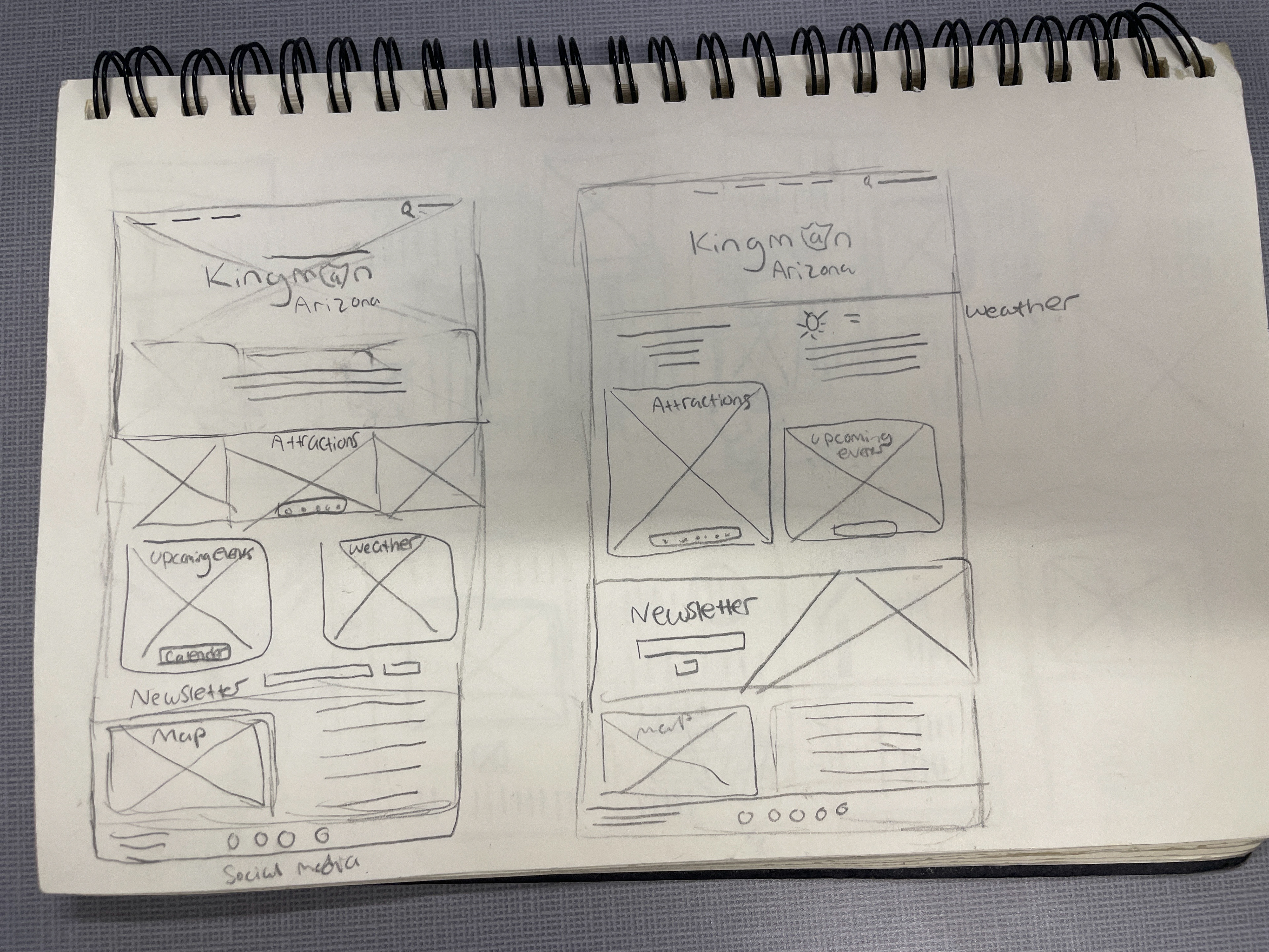
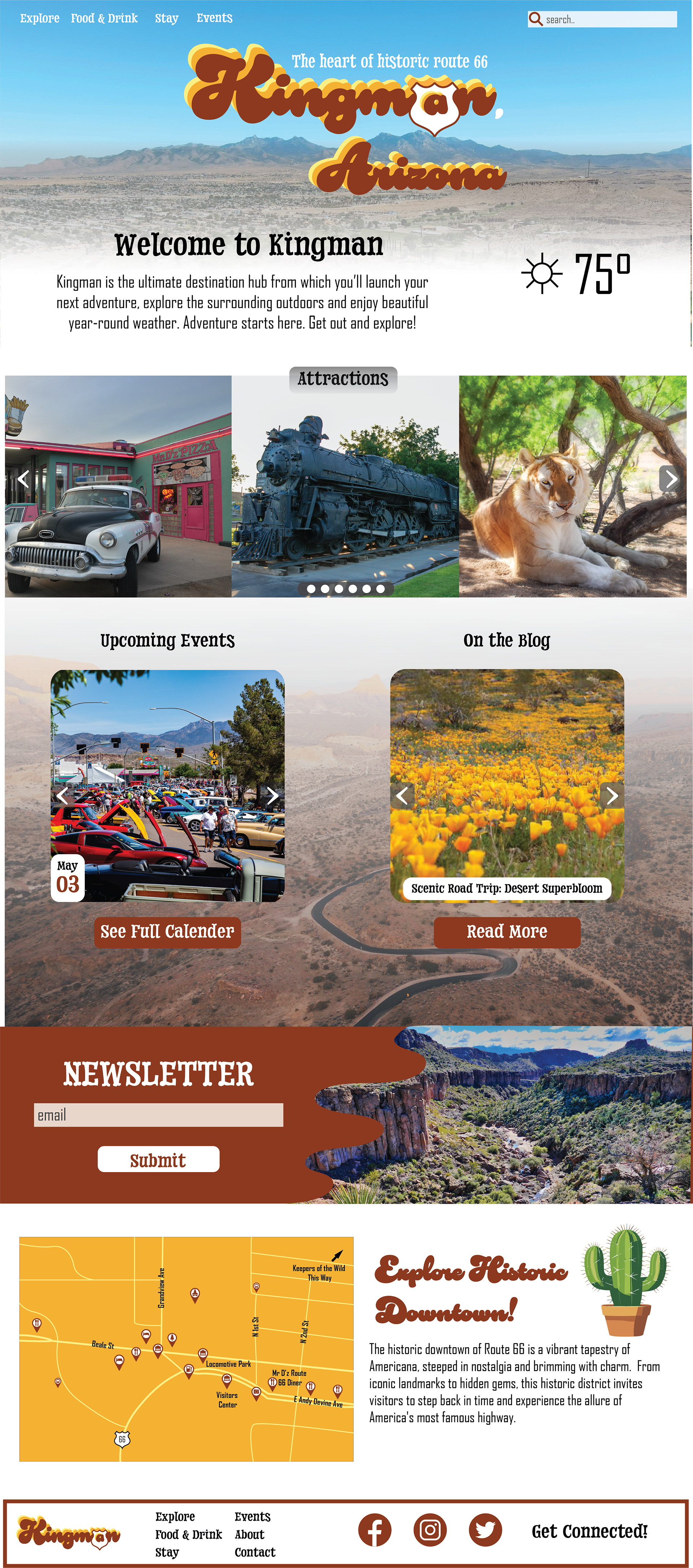
I kept my website wireframes simple, just blocking out the basic layout and what each section would be.
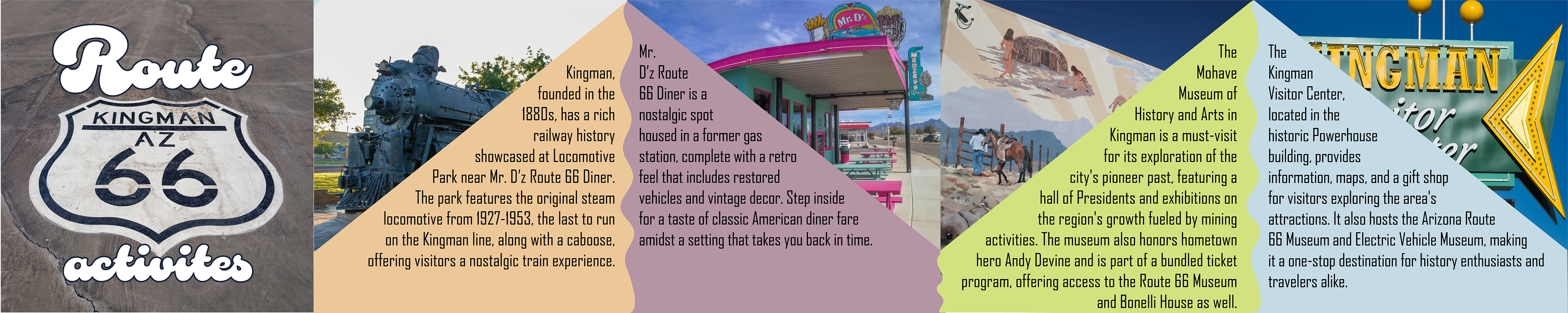
For my actual mockup, I reused a lot of imagery and fonts to keep it consistent with the brochure I created. It mostly consists of carousels, showing the different attractions, events, and blog posts. I included the map and a place to sign up for the newsletter, too.
Instagram Posts
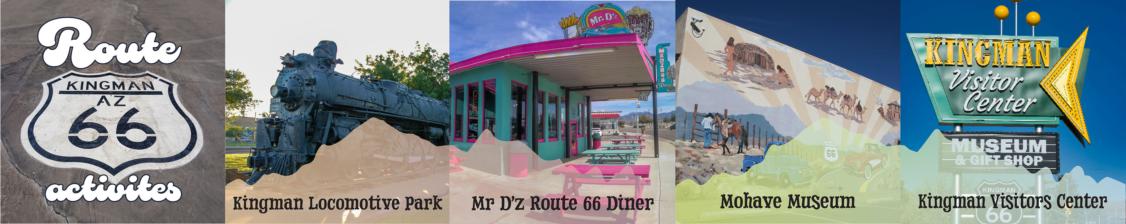
I wanted my Instagram post to look like it was all one picture running together, so I made them all connect with squiggle lines. It regurgitates the same information from the brochure and is just supposed to give the viewer general information.
Final
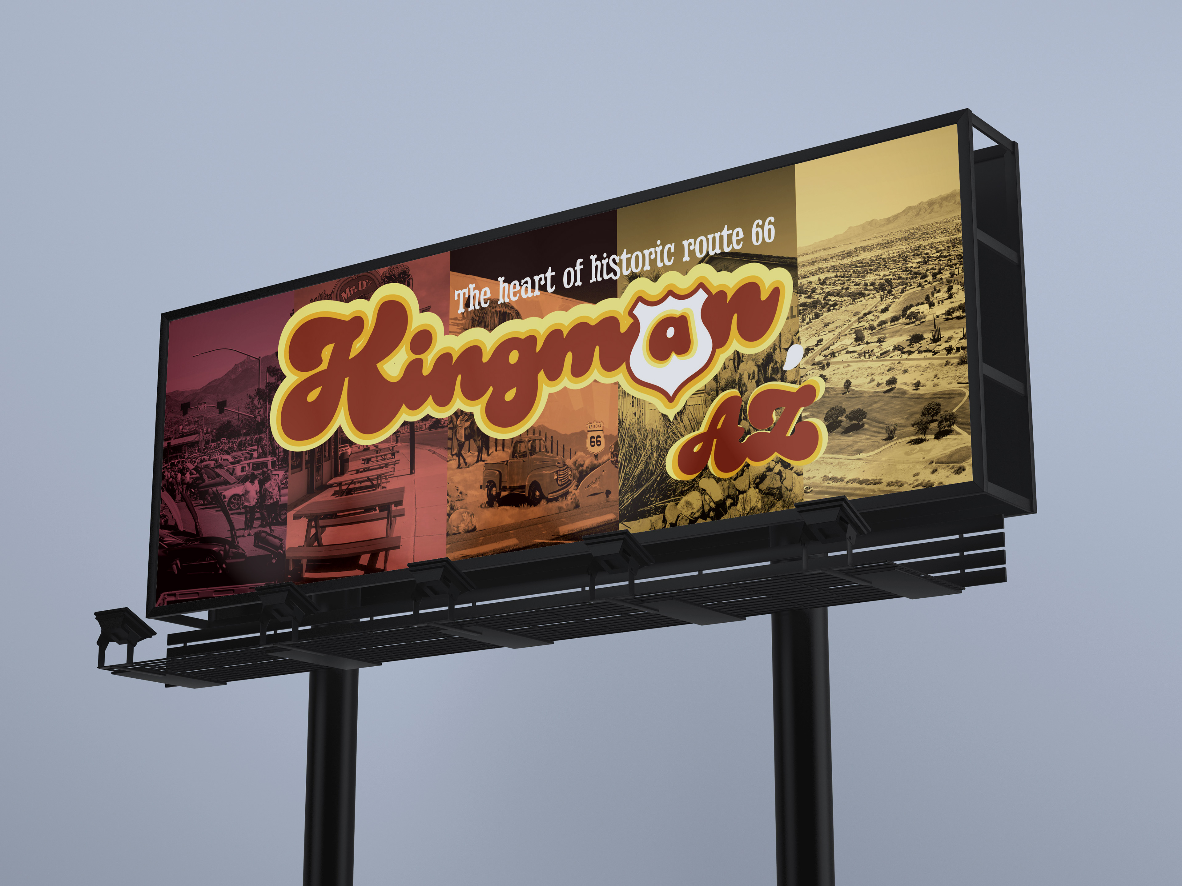
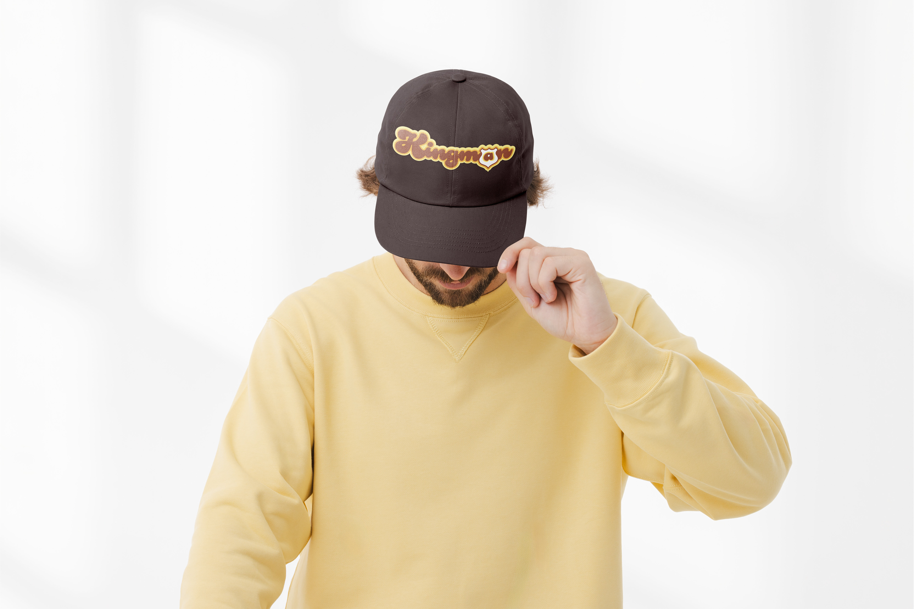
I made quite a few changes for the final edits. The logo did go through a minor change, centering the layered color rather than angling it. As for the brochure, I aged the images, changed the postcard colors to match the newer color palette, and created a new cover inspired by a Jackson 5 album. I used that same concept for a billboard, something that would catch anyone's eye as they drove down the road in the open desert. I got rid of all the copy from the Instagram posts, just included the destination name, and changed the background to a mountain range. I switched the order of the newsletter and the map on the website and made a few other small changes. In addition to having a computer resolution, I created a responsive phone webpage. For my second 3D touchpoint, I have a simple brown hat with the logo featured on it.