

This was a unique school project I got to participate in. Insanitation is a game created by a group of former ACC students who needed a logo and brand guidelines. This was a collaborative project, so I worked with two other students in my class, and we also partnered with a team of French students at Unistra. Our responsibility was to design the logo and build out the brand guidelines, and then our French team would use those to create marketing assets. The logo itself was a true team effort; we each created ideations, refined them, and made the final selection together.
Moodboard
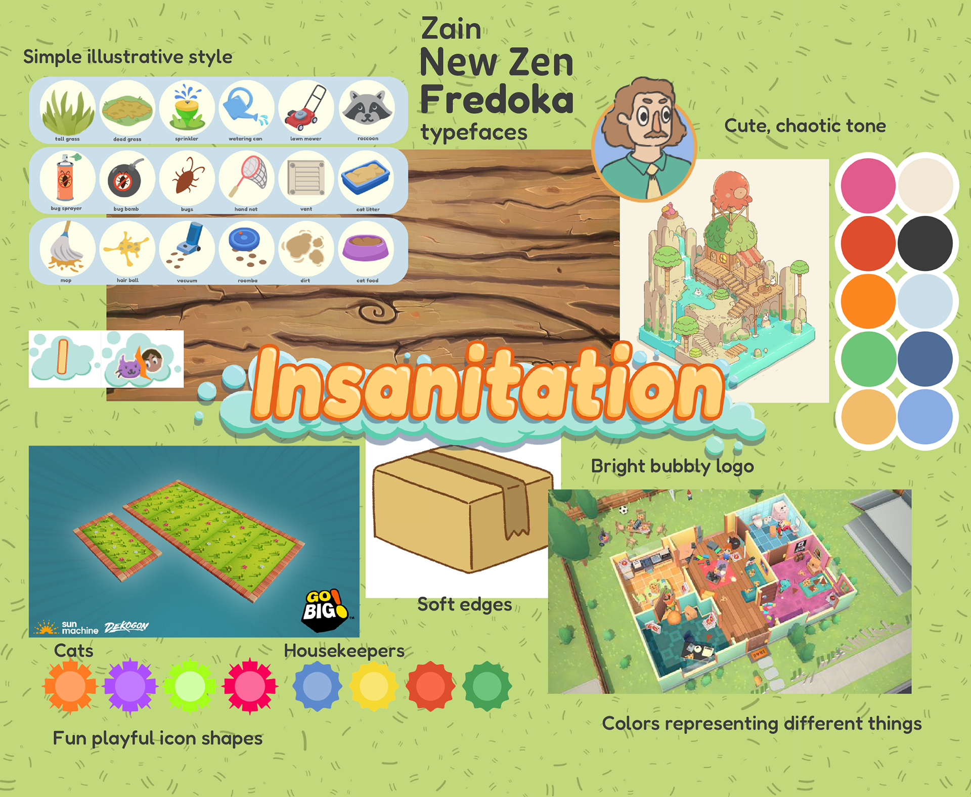
I created the moodboard for our team. I pulled the existing logo and some assets from the game to stay aligned with the visual style they had already established. I also referenced the developers’ own inspiration board and incorporated some of the imagery they had saved. Overall, our goal was to create a bright, illustrative logo that fit seamlessly with the game’s current art style.
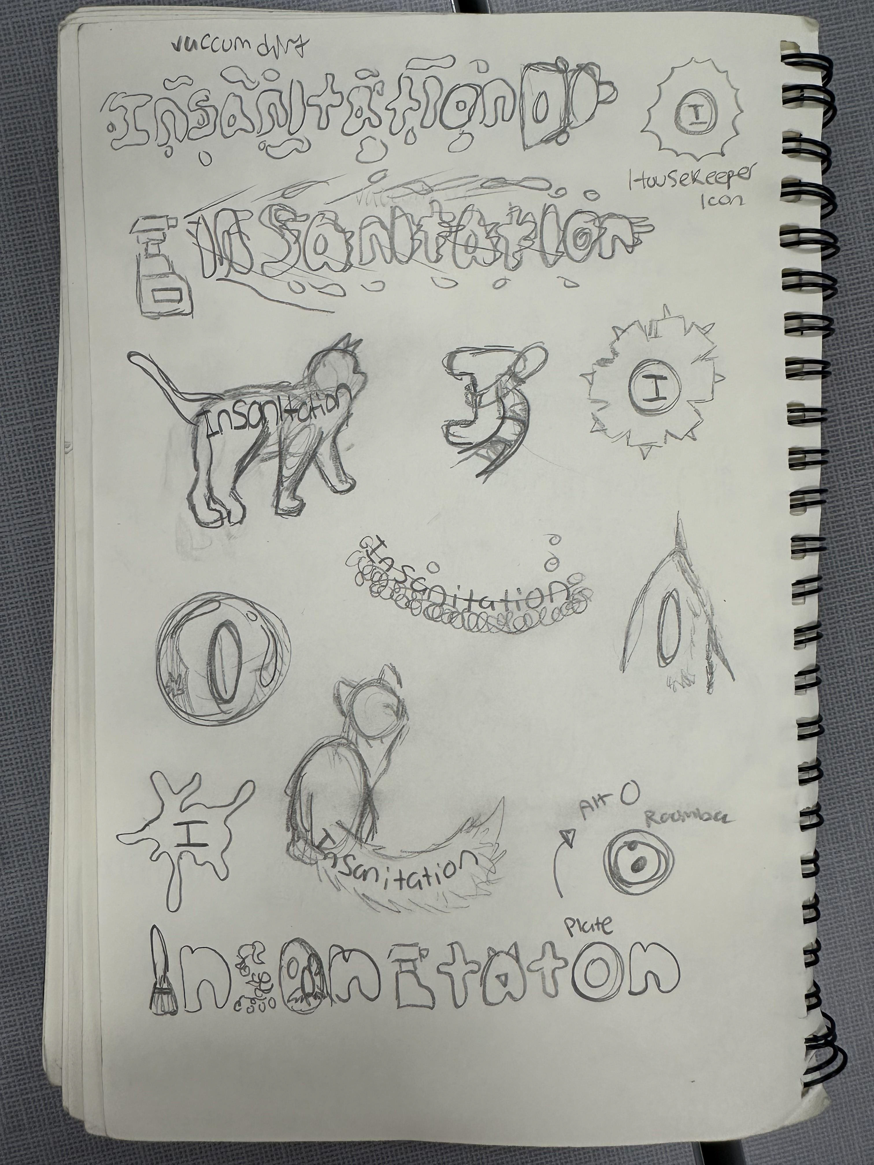
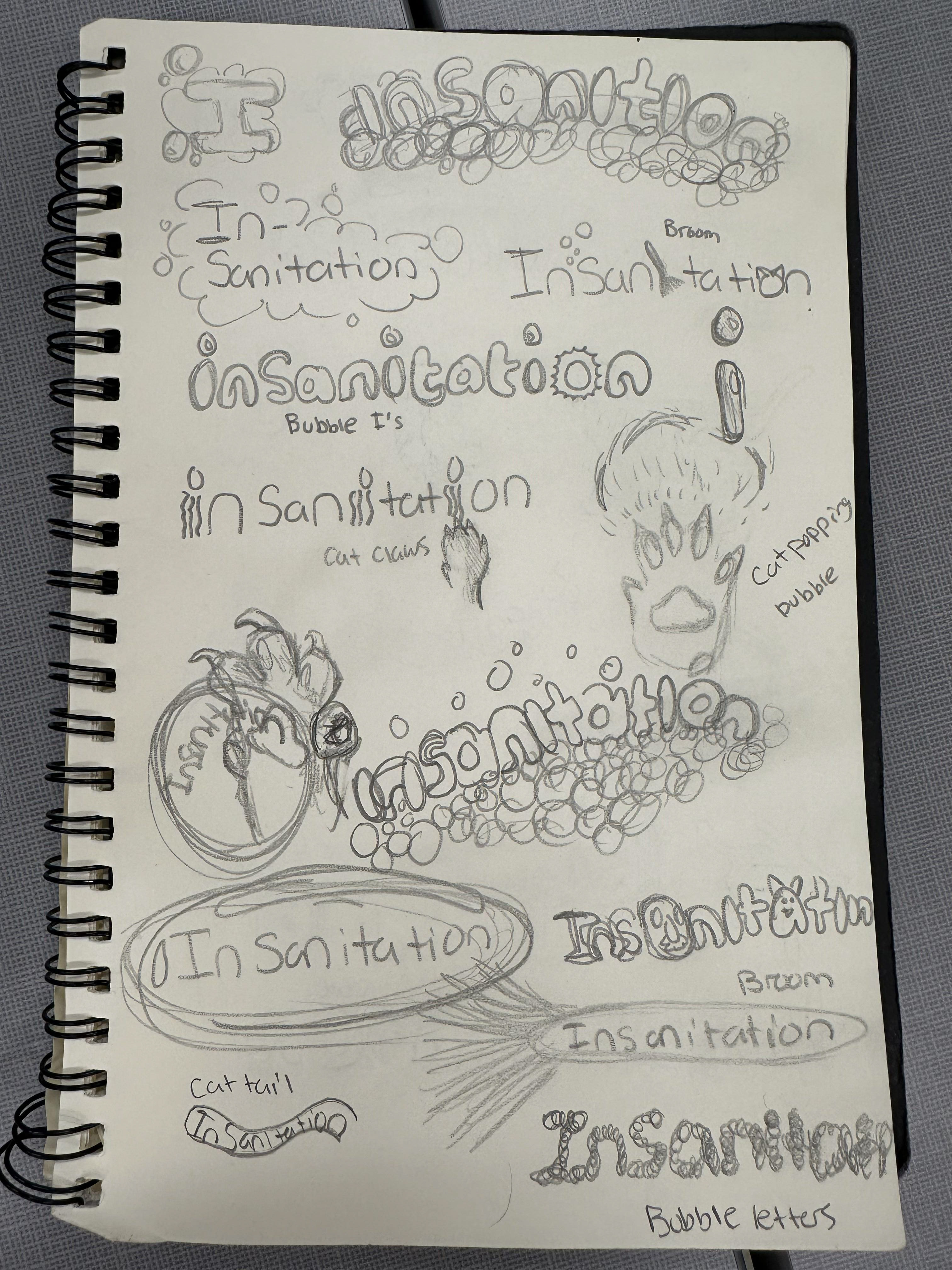
Sketches
One of the primary aspects of the game is the opposing dynamic between the housekeepers and the cats. The cats are constantly ruining whatever the housekeepers clean, so every visual reference is meant to reflect that conflict in some way. I featured a lot of bubbles and cleaning supplies to display the nature of the game.
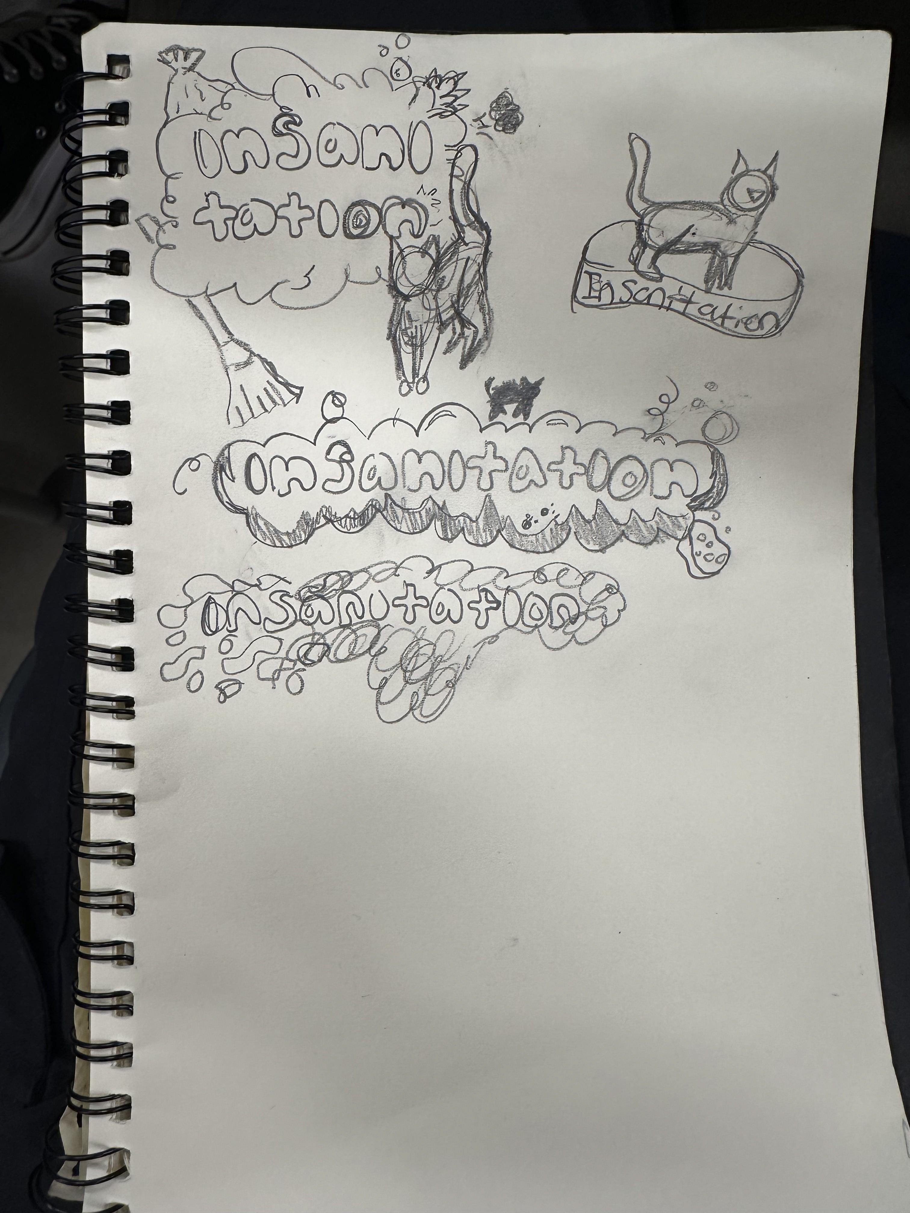
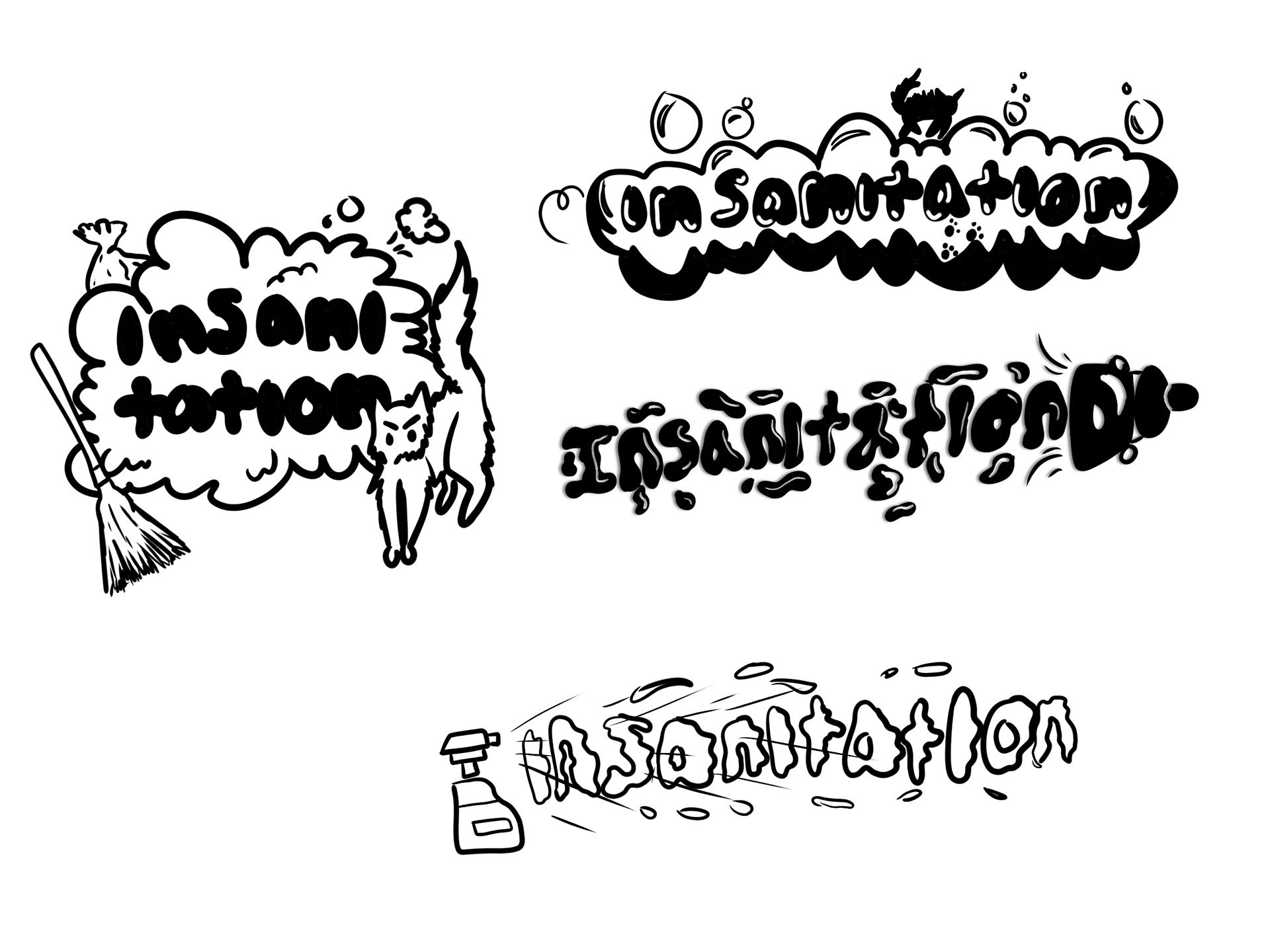
Digital Sketches
My teammates and I decided to pick our favorite personal sketches and digitally refine them. These are the 4 of mine I believe had the most potential, they have an element of chaos but still illustrate the purpose of the game effectively. A big inspiration for these was the logo for Overcooked.
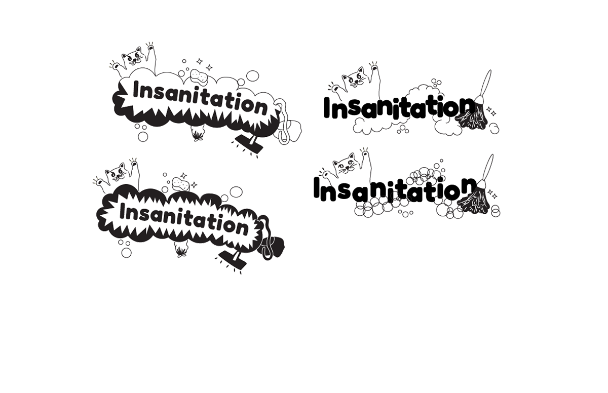
Digital Drafts
In the end, we decided to move forward with one of my teammates' sketches. Each of us took the sketch and recreated it in Illustrator, putting our own style and spin on it.
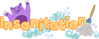
We each took our favorite refinement that we did and added color to it. We kept the same font as the original logo, and I decided to keep the original colors from it, too. The purple cat was inspired by the colors of the housekeeper, though in hindsight, there is no purple cat in-game, so this decision did not make a lot of sense.
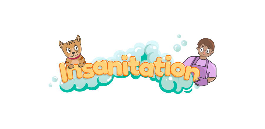
After discussion with the developers, we decided to majorly rework the logo to clearly show what the game is about. Using one of my teammates' new illustrations, I added the detail and color to give it a playful and cute vibe. The arc of bubbles frames the text and communicates the nature of the game.
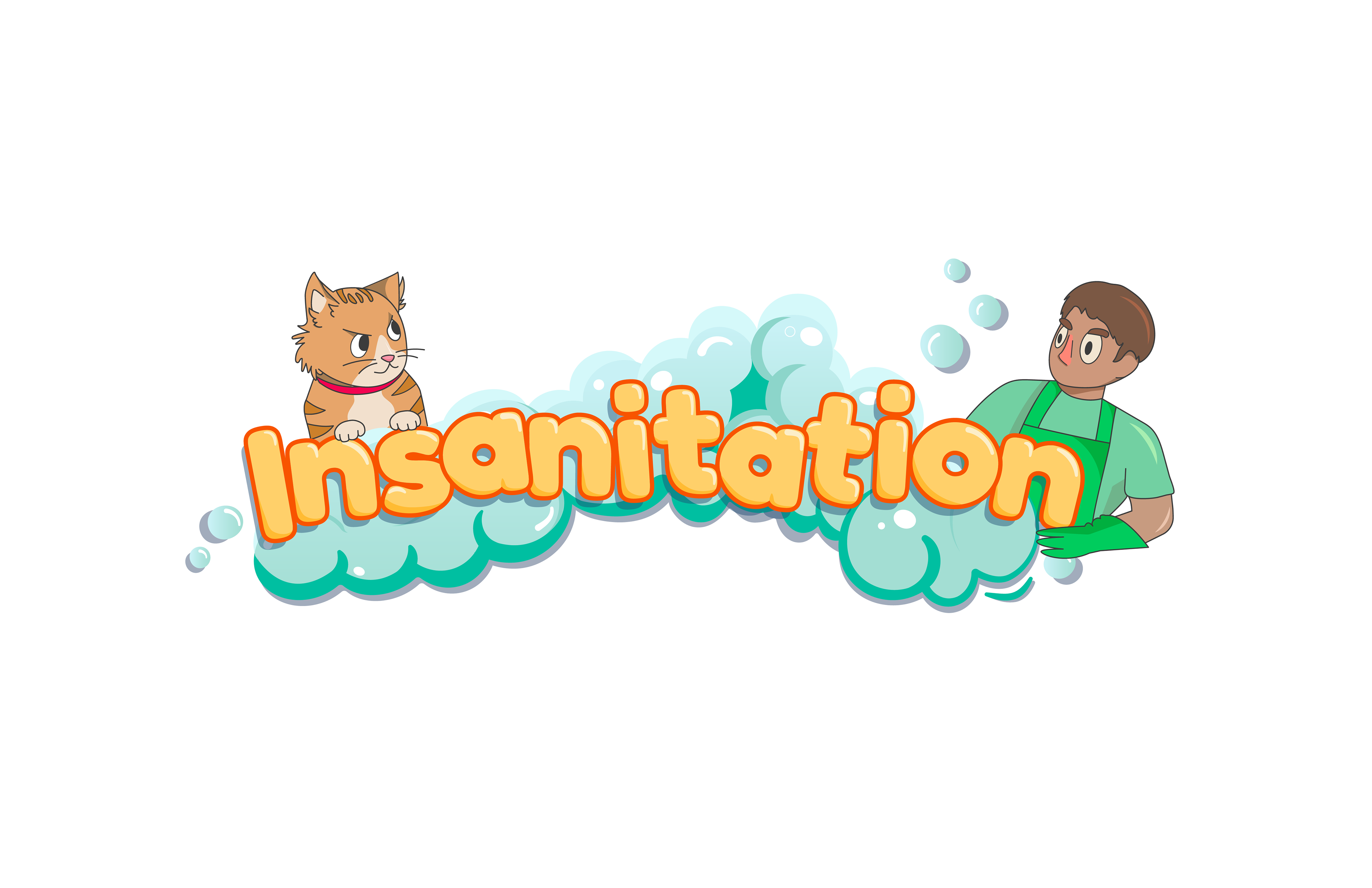
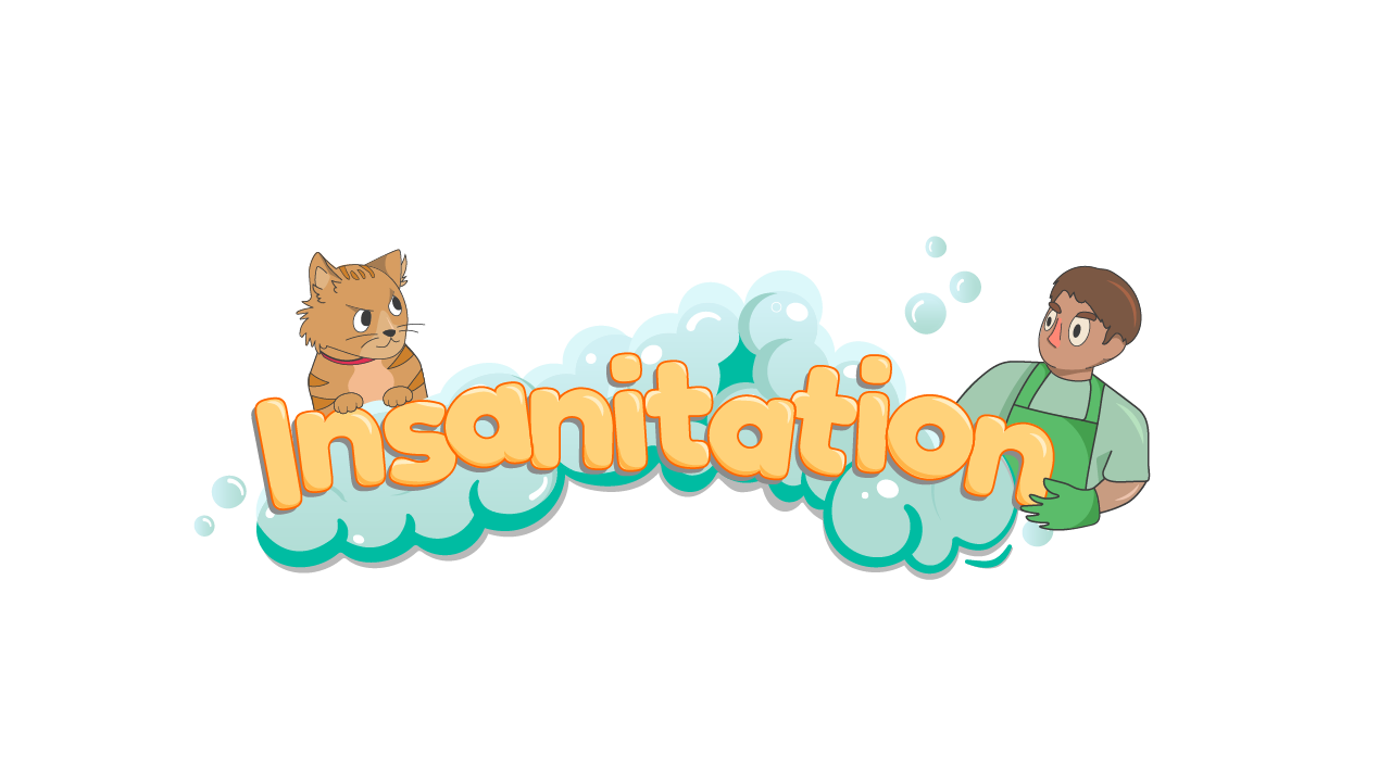
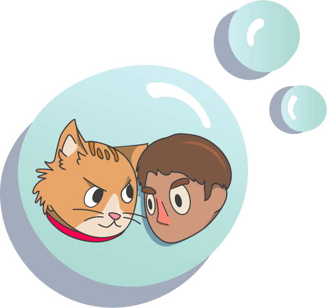
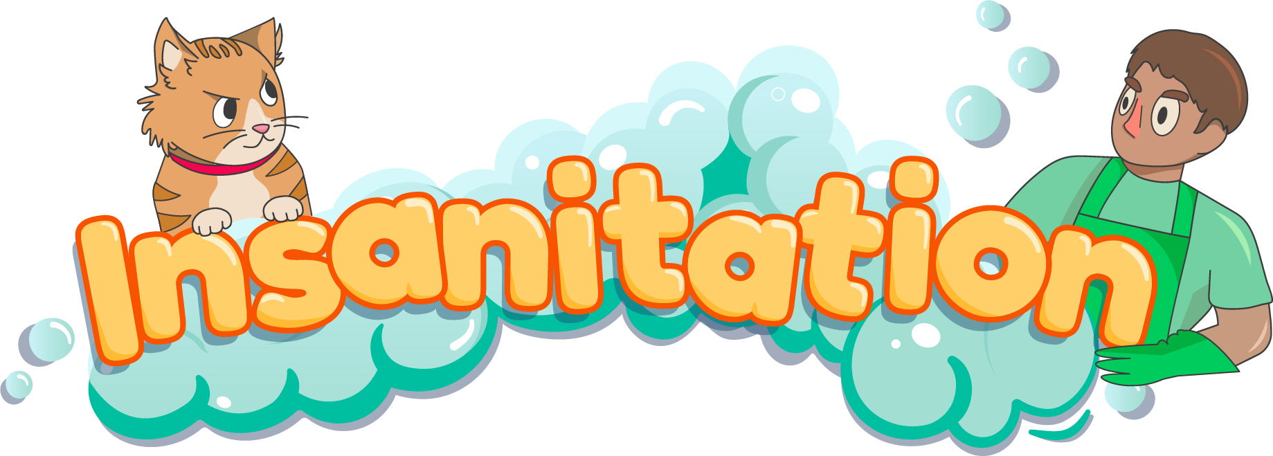
After talking to the developers one more time and receiving feedback, I redrew the heads of both the cat and the housekeeper to face each other. This is to really display the tension between the two and display their rivalry. We also changed the clothes of the housekeeper to green to accurately reflect one of the actual clothes options in the game. High and lowlights were also added to the text to give it the same bubbly sheen as everything else.
Final
We made a couple more changes to it before finalizing it, such as giving it an overall brightening of the colors and making the cat's belly white. The hand on the housekeeper was something we were never really happy with and did not look anatomically correct, so I was tasked with recreating it. In the game, the keepers only have 3 fingers and a thumb, which is why it still does not look quite humanoid. We also created two logo icons, one with just the "I" and one showing the rivalry between the two opponents.

View the brand guidelines here