This project was for us to choose a topic of our choice and make an infographic about it. I decided to make mine about the impact of Instagram on mental health and why it is bad for you. There was a lot of research involved in this project to have it actually be factual, which proved to be a good learning experience. I am in my own target audience for this project, and I think that helped a great deal with the facts and creation of this infographic.
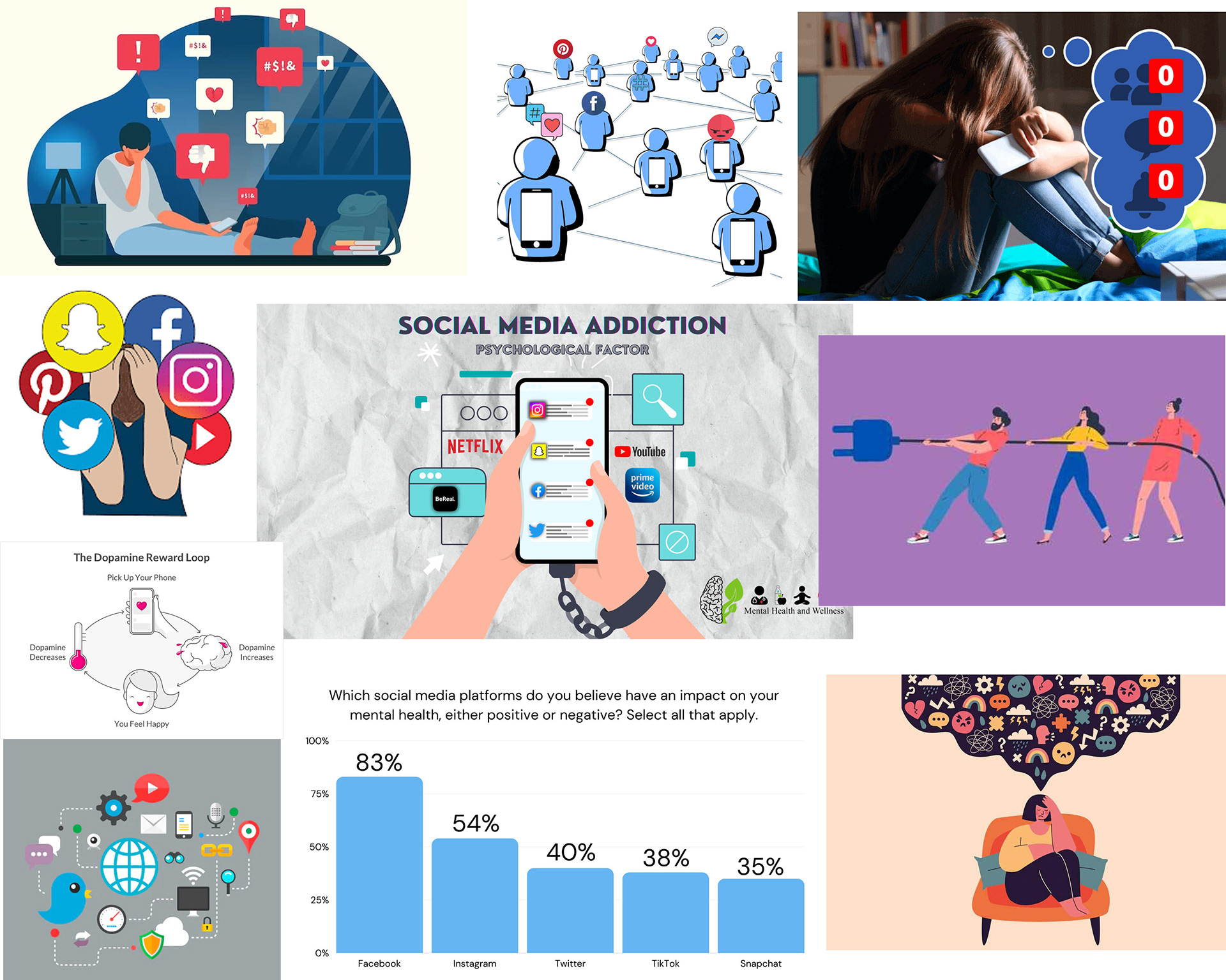
Moodboard
I wanted to lean a little bit into the corporate infographic style, and also use photography as the main style, like the top right photo on my moodboard.
Sketches
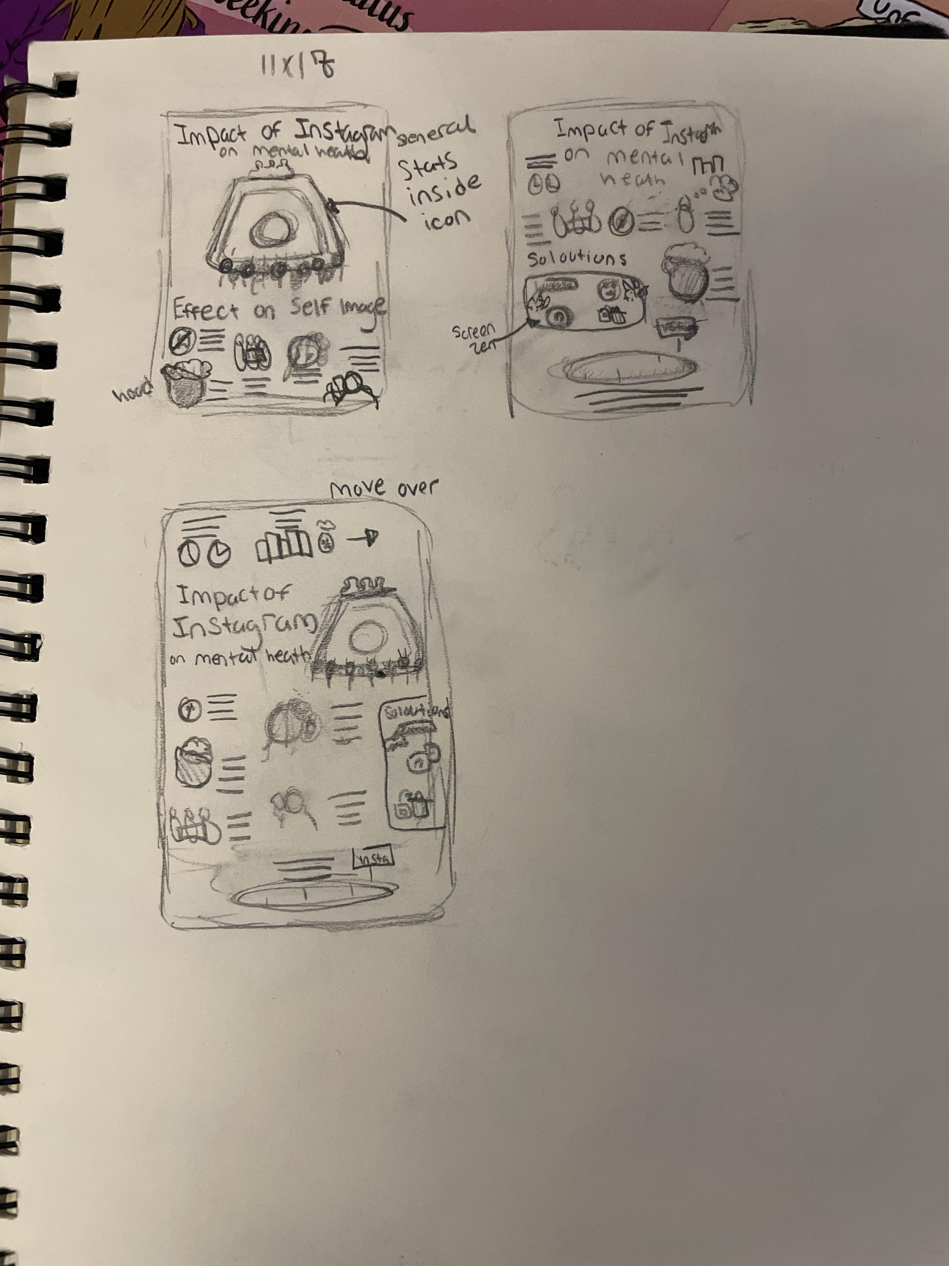
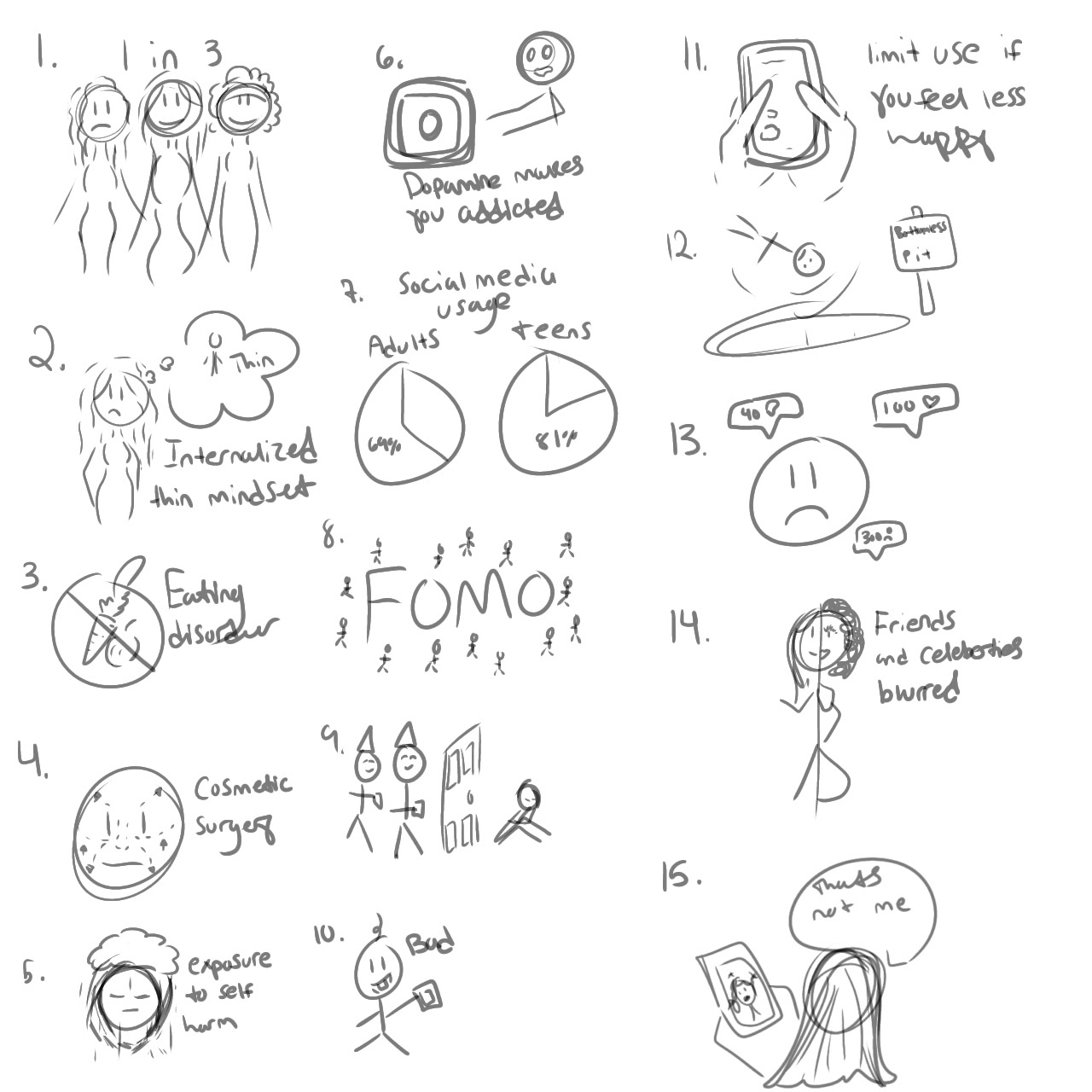
The more I thought about it, I could not envision any of my datapoints as photographs. I decided that I wanted to do a more sketchy style and draw out everything on my tablet. These ideas came to me a lot more easily and worked out a lot better in the long run. My goal was to make people consider using Instagram less or even deleting it altogether, so having things like charts and more dramatic imagery felt vital.
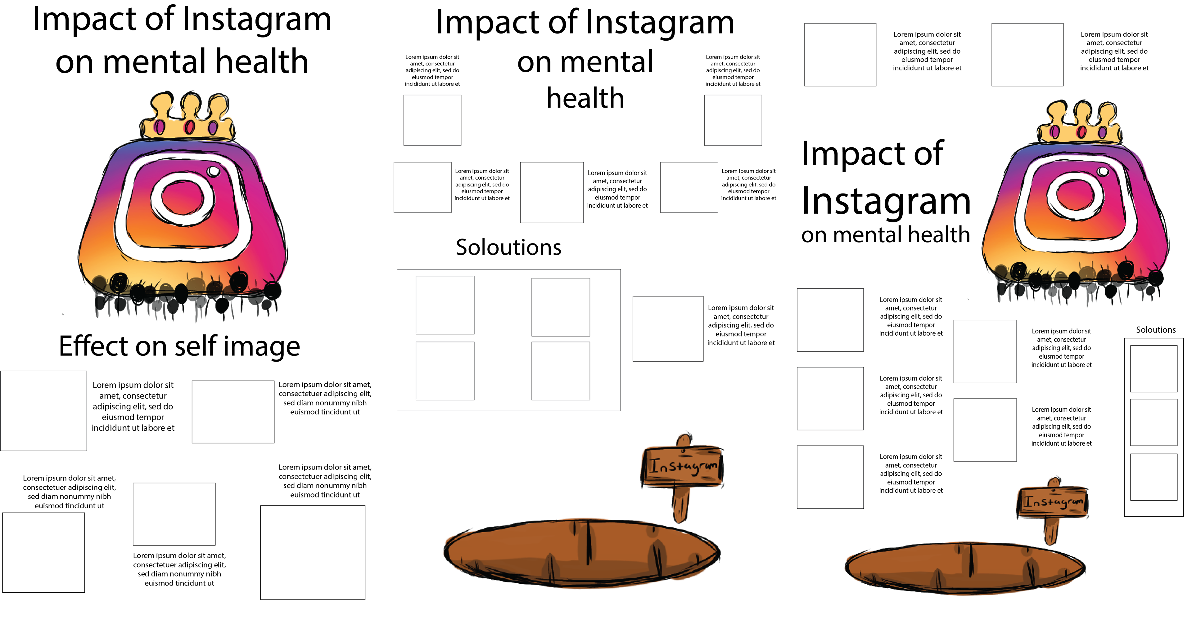
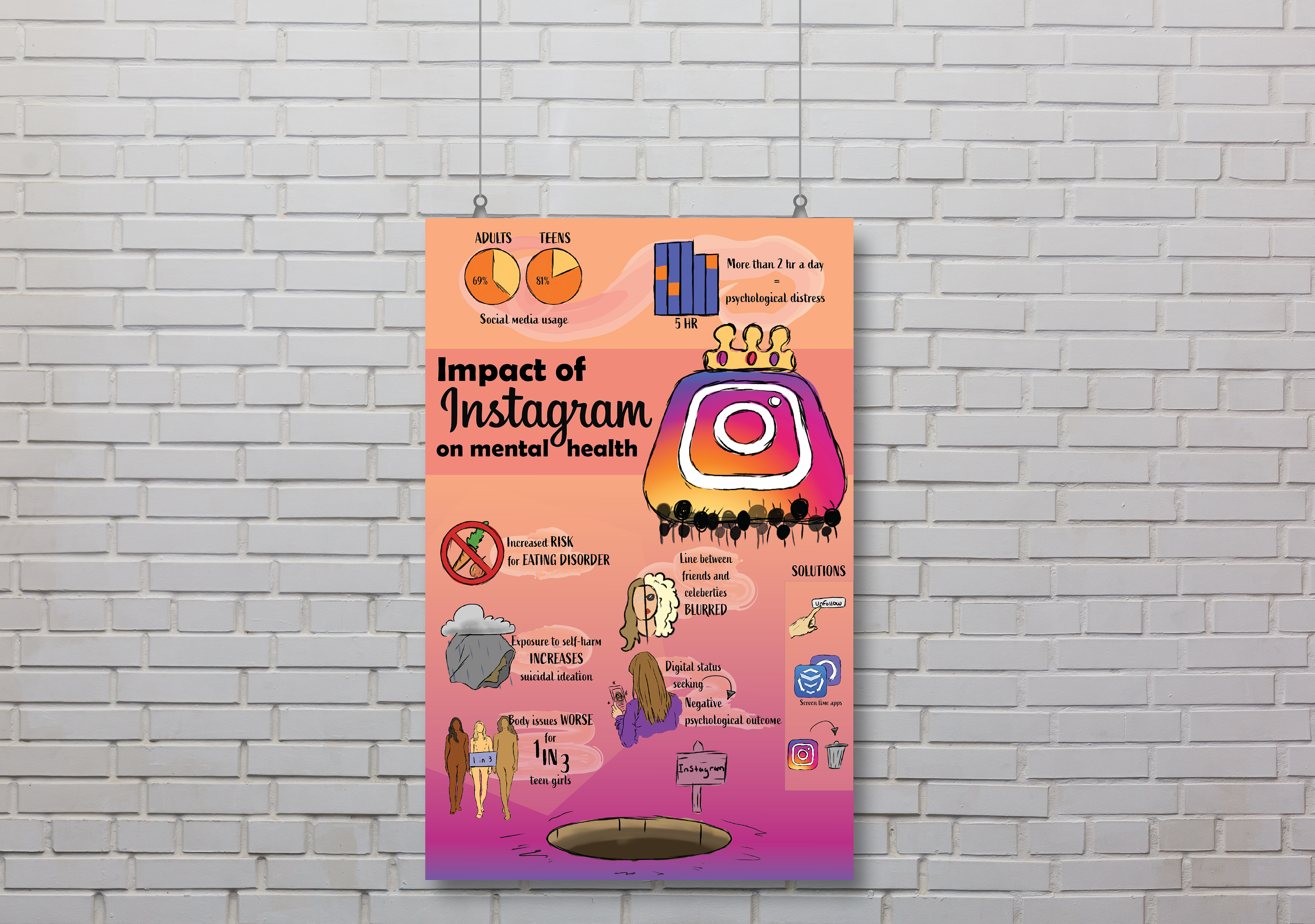
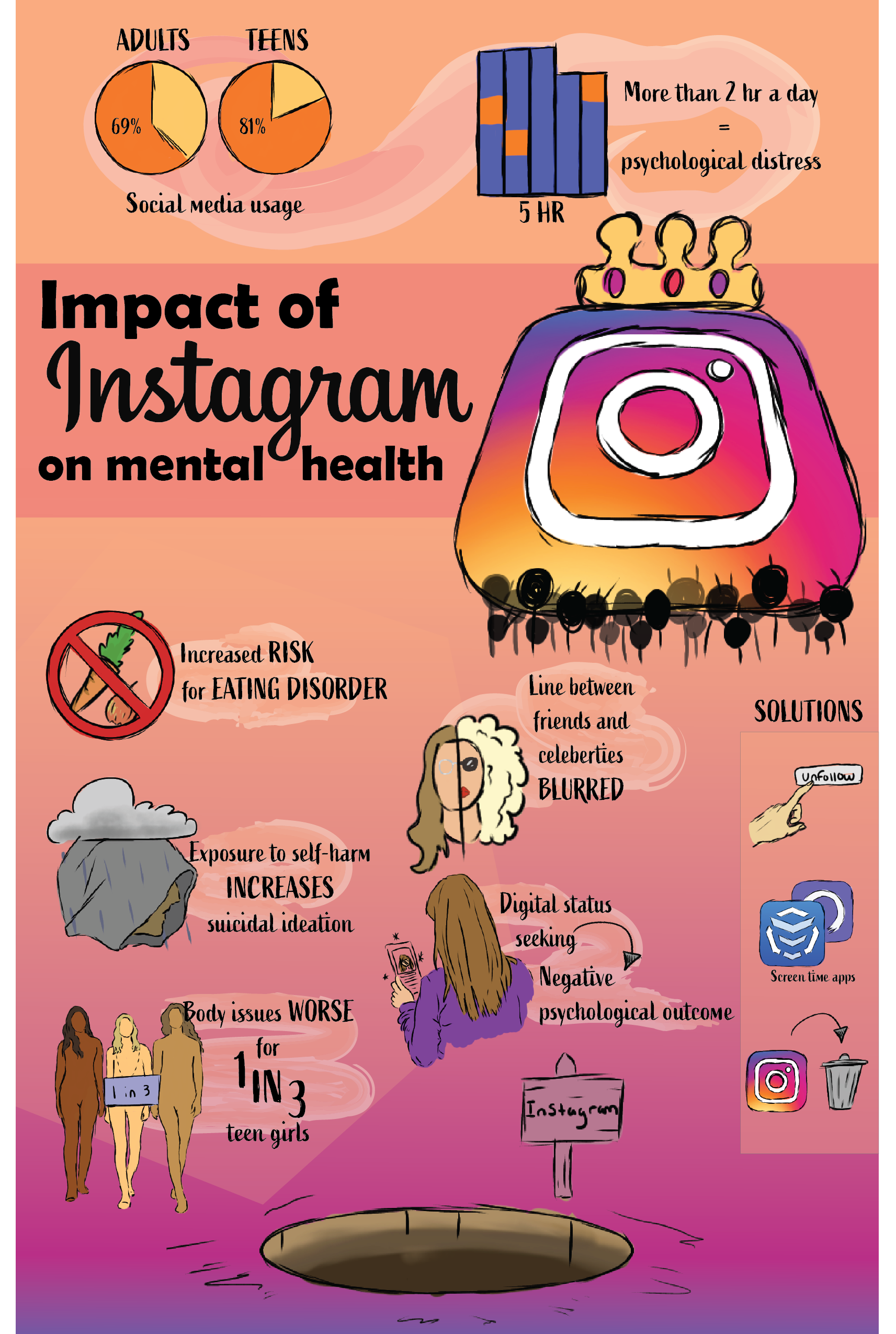
Coming up with the layout was a very daunting task because I had a lot of information I needed to fit in a pretty limited space. I knew that I wanted the Instagram to be pretty large, which is why I have it featured as a centerpiece in most of these, wearing a crown. My third layout I created was a kind of combination between the first 2, and it was what I liked the most.
Digital Drafts
I made a digital draft of the layout I really liked, as well as one I was not too enthused about, just to see. I liked the one featuring the logo better, but it felt very flat and lifeless. I wanted to type for the body that would mimic handwriting, to match the style of the illustrations I have. The font I chose for the title also has handwriting-like qualities to it, but I wanted it to be bigger and more legible from a distance.
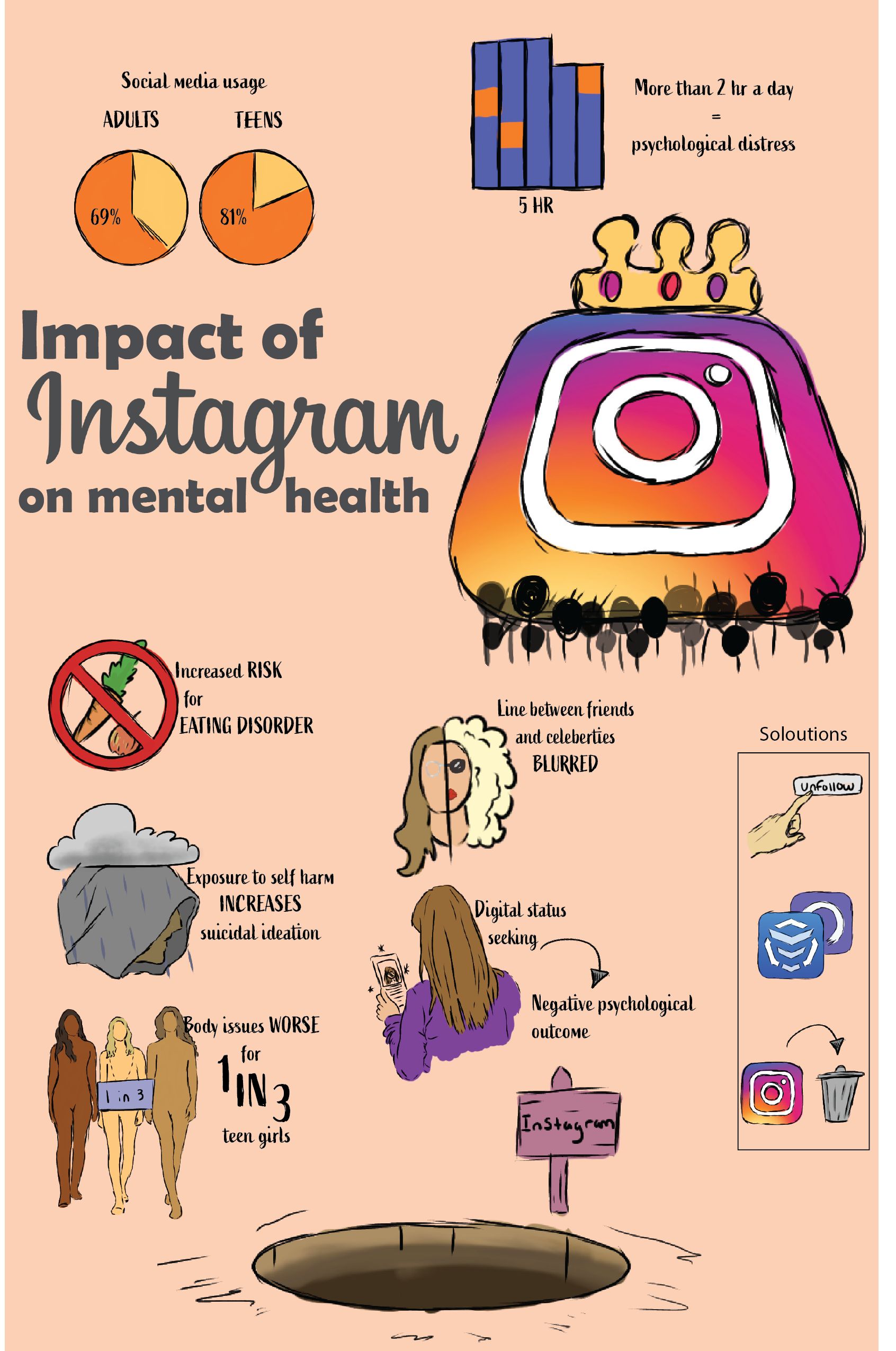
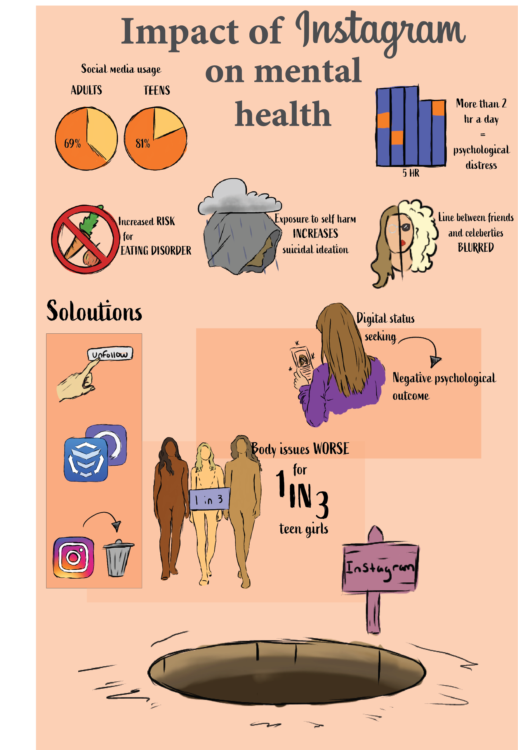
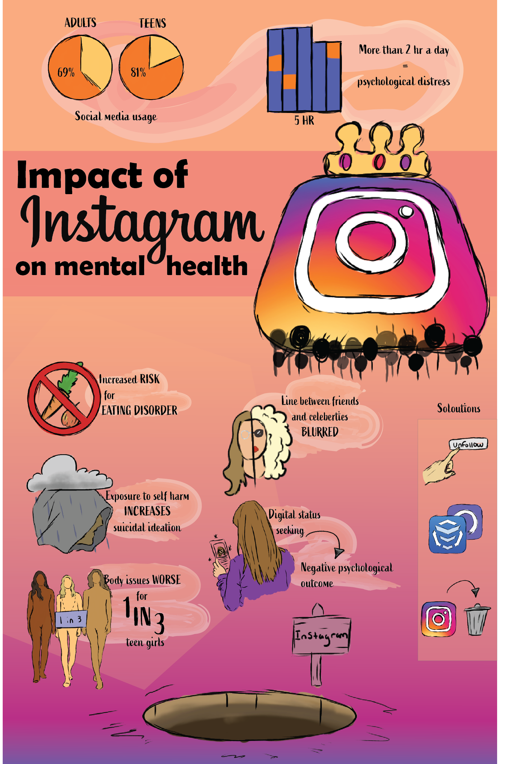
In order to create more visual interest, I created a gradient out of the colors from the Instagram logo. I also added watercolor splotches behind each individual block of text to break it up and create a little more flow instead of things just floating on a page. A horizontal banner behind the title also broke up things a little more into sections.
Final
The final edits I made were just to type placement to make it flow smoothly. Putting all this together felt like a puzzle, because of the need for negative space around everything, but still wanting it to look filled with information.

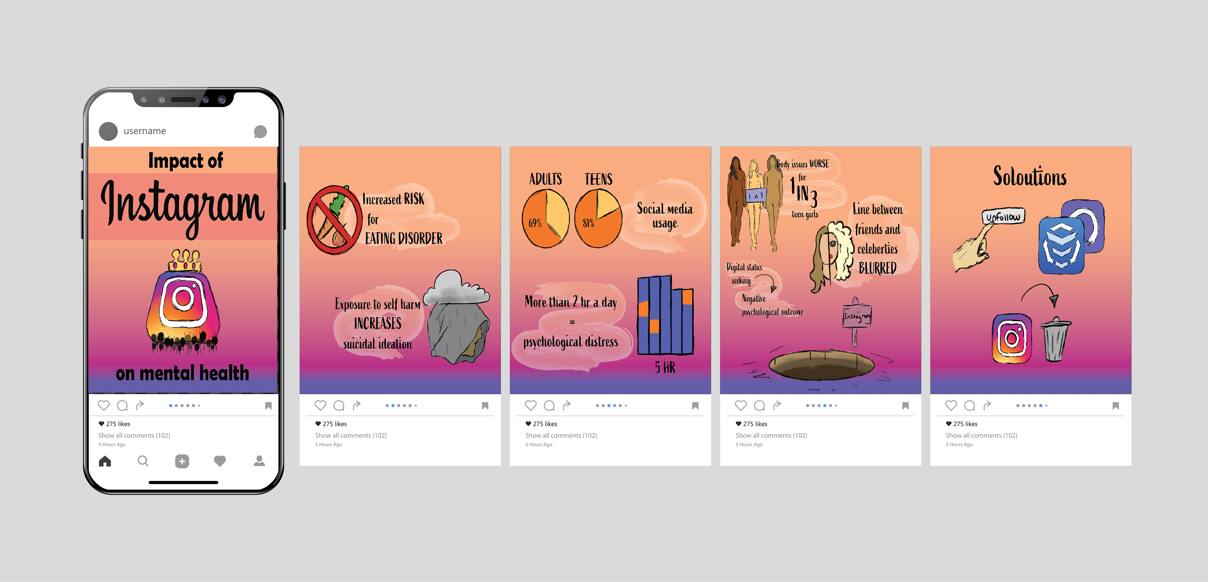
Instagram Posts
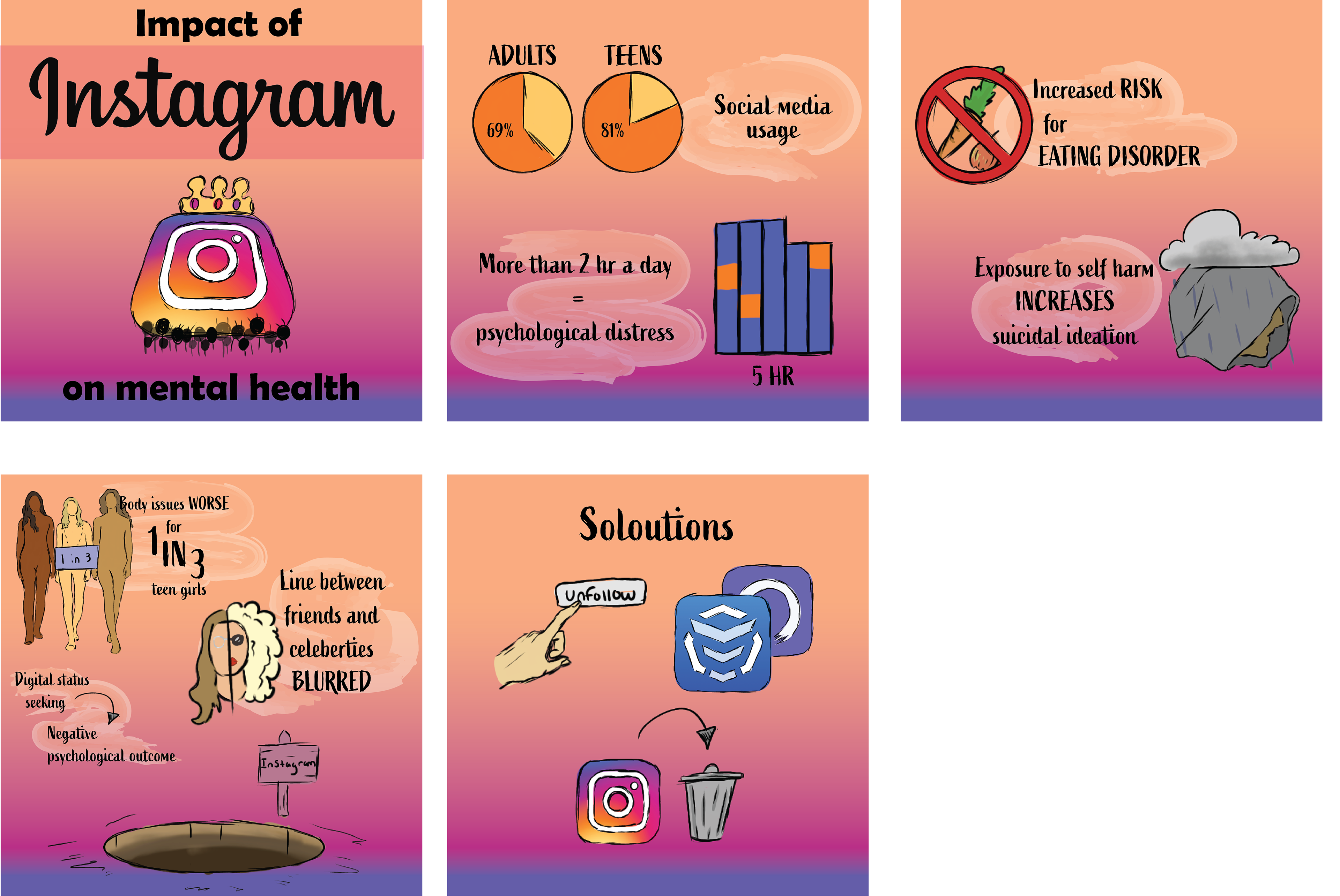
Ironically, part of this project was also creating Instagram posts about our infographic. Mine were very simple regurgitations of the data points I had already made.