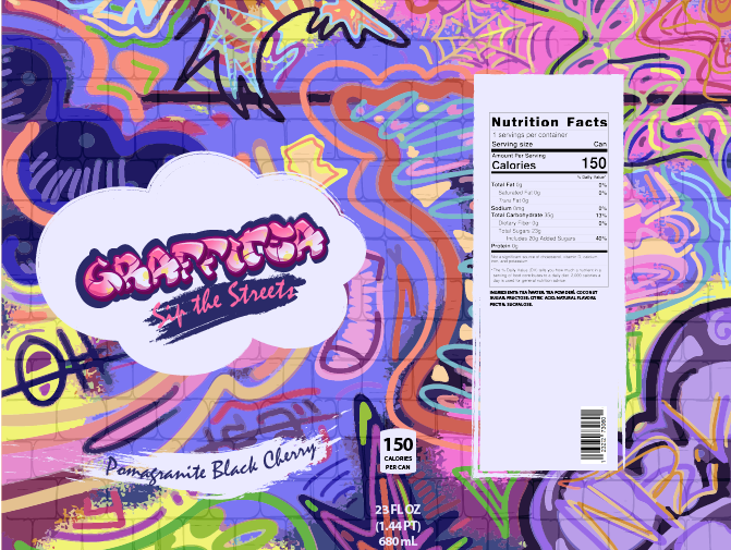
This school project was to create a bottle label for a specialty brand of our own creation. I wanted to create a tea brand inspired by graffiti and street art, and I landed on the name Graffitea. It needed to be more elevated than most tea brands you would come across in the grocery store, so I chose flavors that sound very out there and would appeal to people who love to try new things. The premise of the assignment was to cater to a gourmet market with a lot of disposable income, so the challenge for me was to make graffiti look high-end.
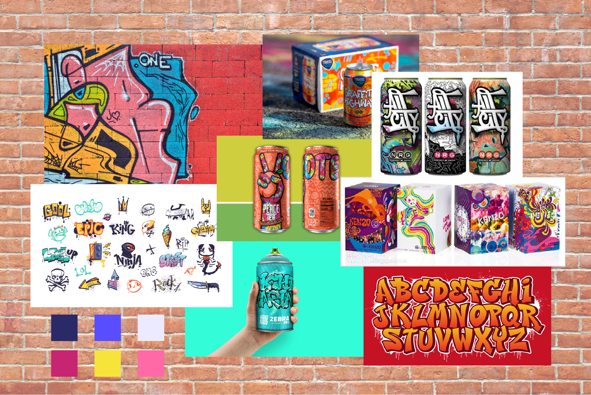
Moodboard
Immediately, my first thought for inspiration was Peace Tea. Their vibrant colors and little doodles felt like a good starting place for my moodboard. I also looked for more graffiti-inspired packaging and found a few examples, as well as some fonts that mimicked the style. I knew I wanted a brick texture as a base to convey that it was on a wall, so I used that as the background here.
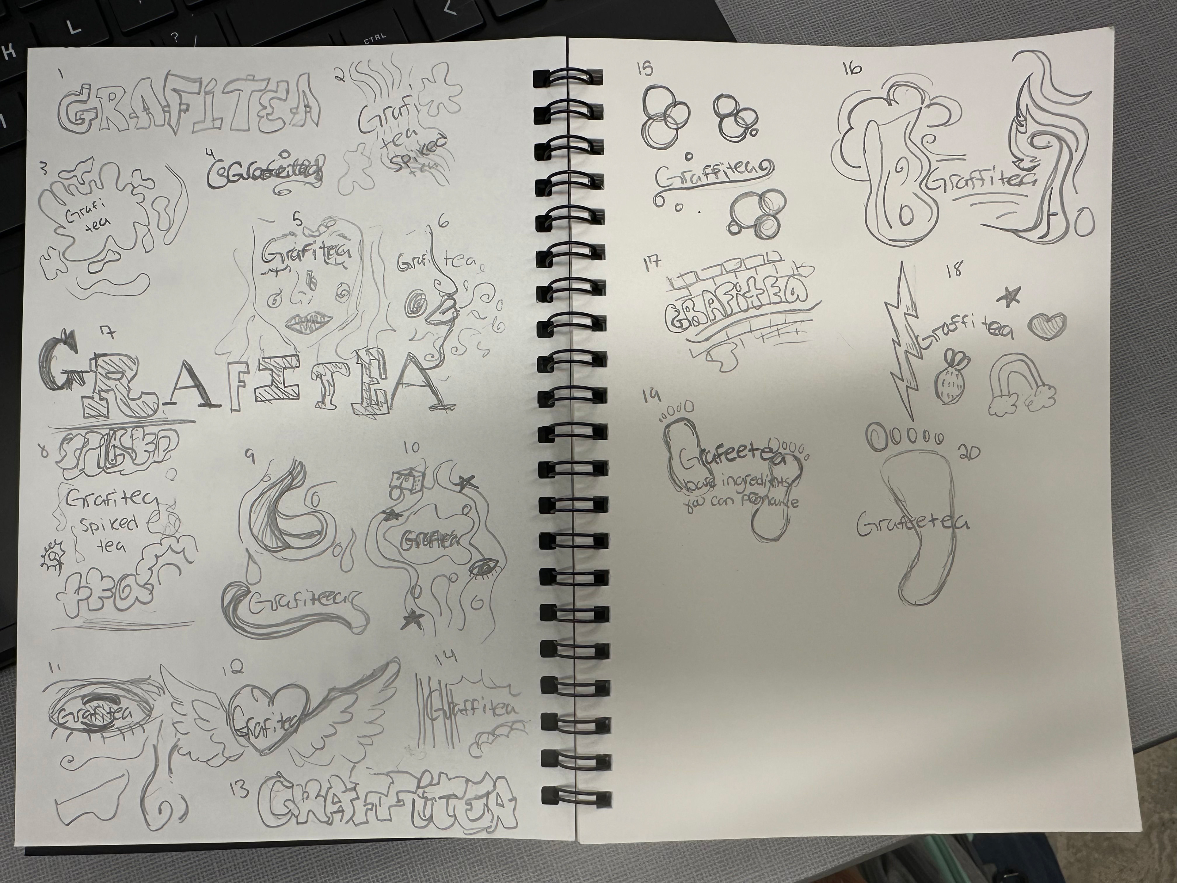
Sketches
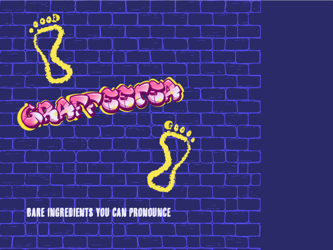
The logo needed to be in graffiti lettering, but still readable from a distance. Typically, there is nothing legible about graffiti, so I had to compromise a little with the lettering and just keep it kinda bubbly in the sketches. I experimented a lot with different styles, using shapes and lines, and even little doodles. There was also the thought of changing the name to "Grafeetea", and the tagline would be bare ingredients you can pronounce. The imagery for that would be, of course, feet.
First Drafts
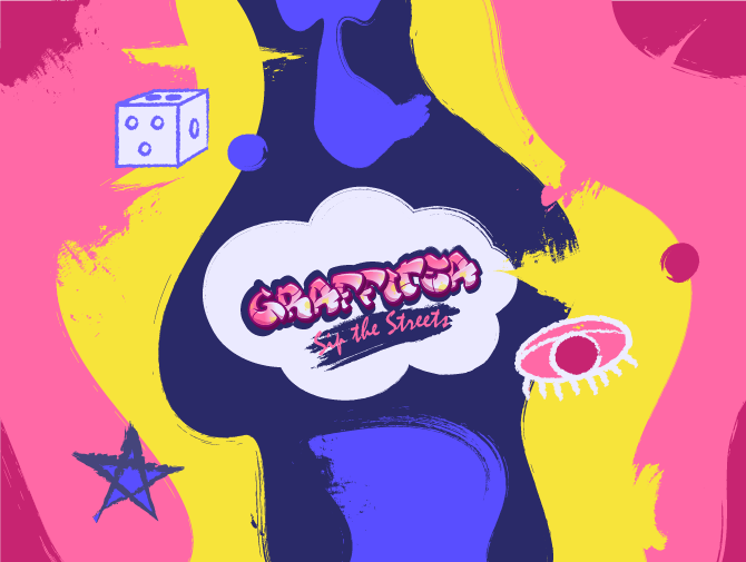
The logo I landed on wasn't really any of my sketches; I just used a good graffiti font I found. I started creating digital drafts with no real direction other than knowing I wanted the bricks and this certain color palette. Two of them used the Grafeetea name, and I included illustrations of feet. I explored creating a graffiti-like background with brush strokes and blobs, but something was still missing.

Background progress shot
Reworked Drafts
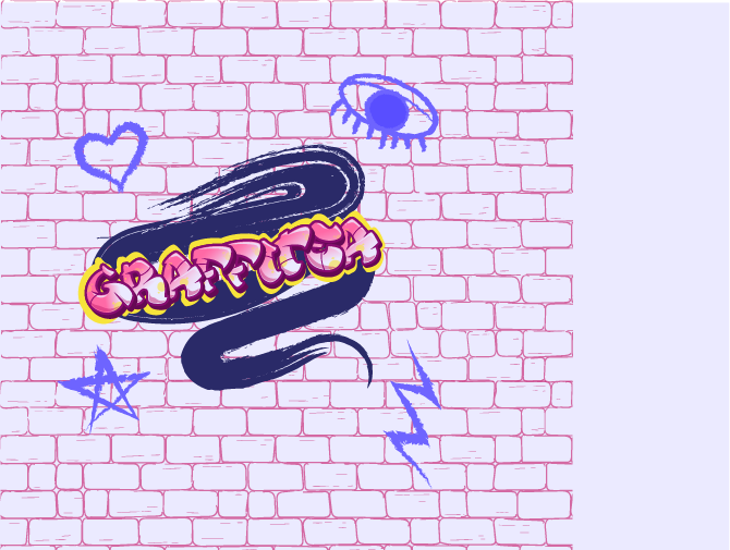
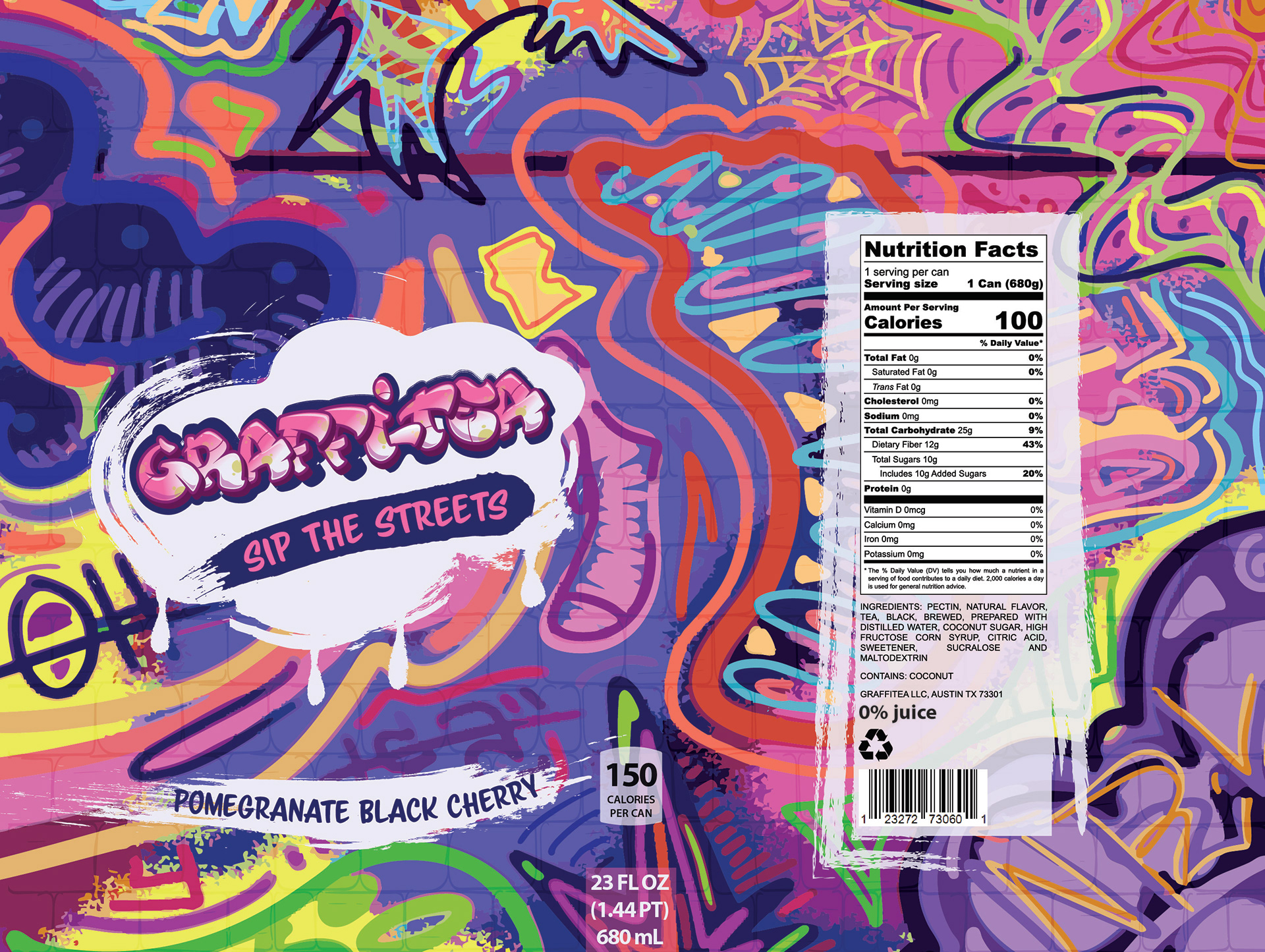
I pulled out my tablet and just began drawing on a blank canvas. I had never drawn anything in the style of graffiti before, so I was using a lot of references, but I was liking the direction that it was going in, and after a few hours, I had filled out the entire canvas with lines and color. I stuck that as the background and used solid color blocks to break it up from the text and nutrition facts.
I reworked the nutrition facts to make them more realistic and added a dash between Graffi-Tea so it’s immediately clear that the product is tea. I also updated the fonts for the tagline and flavor, experimenting with swapping their placement. On top of that, I adjusted the “cloud” shape so it looks more painted on and less like a set of perfectly clean lines.
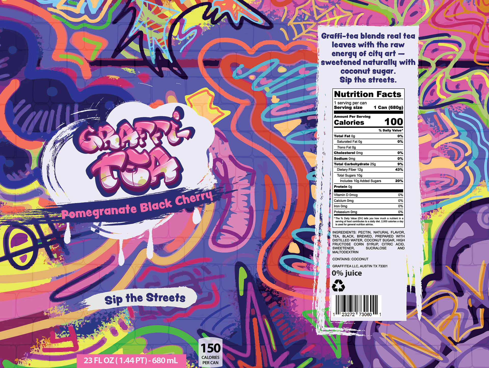
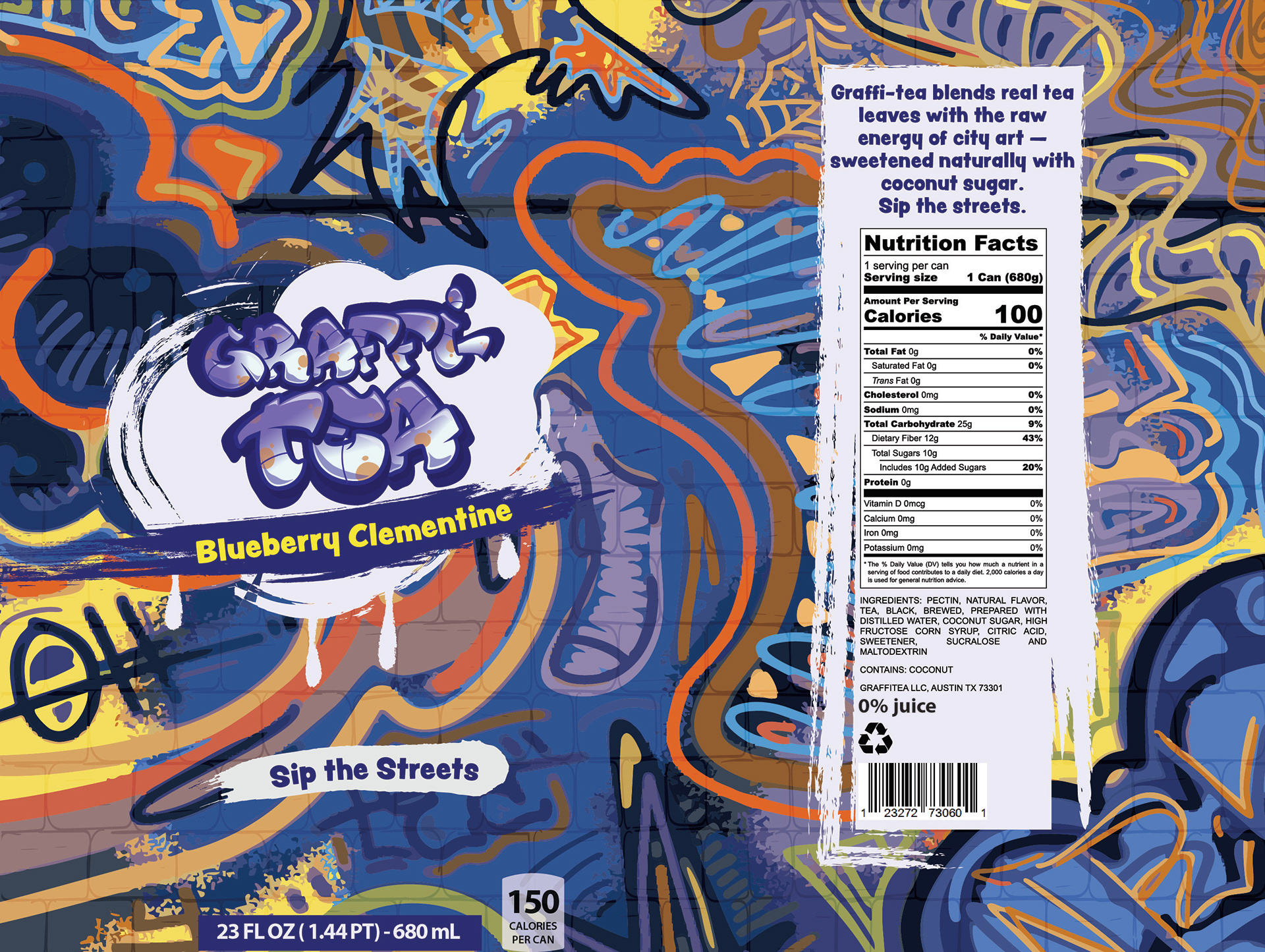
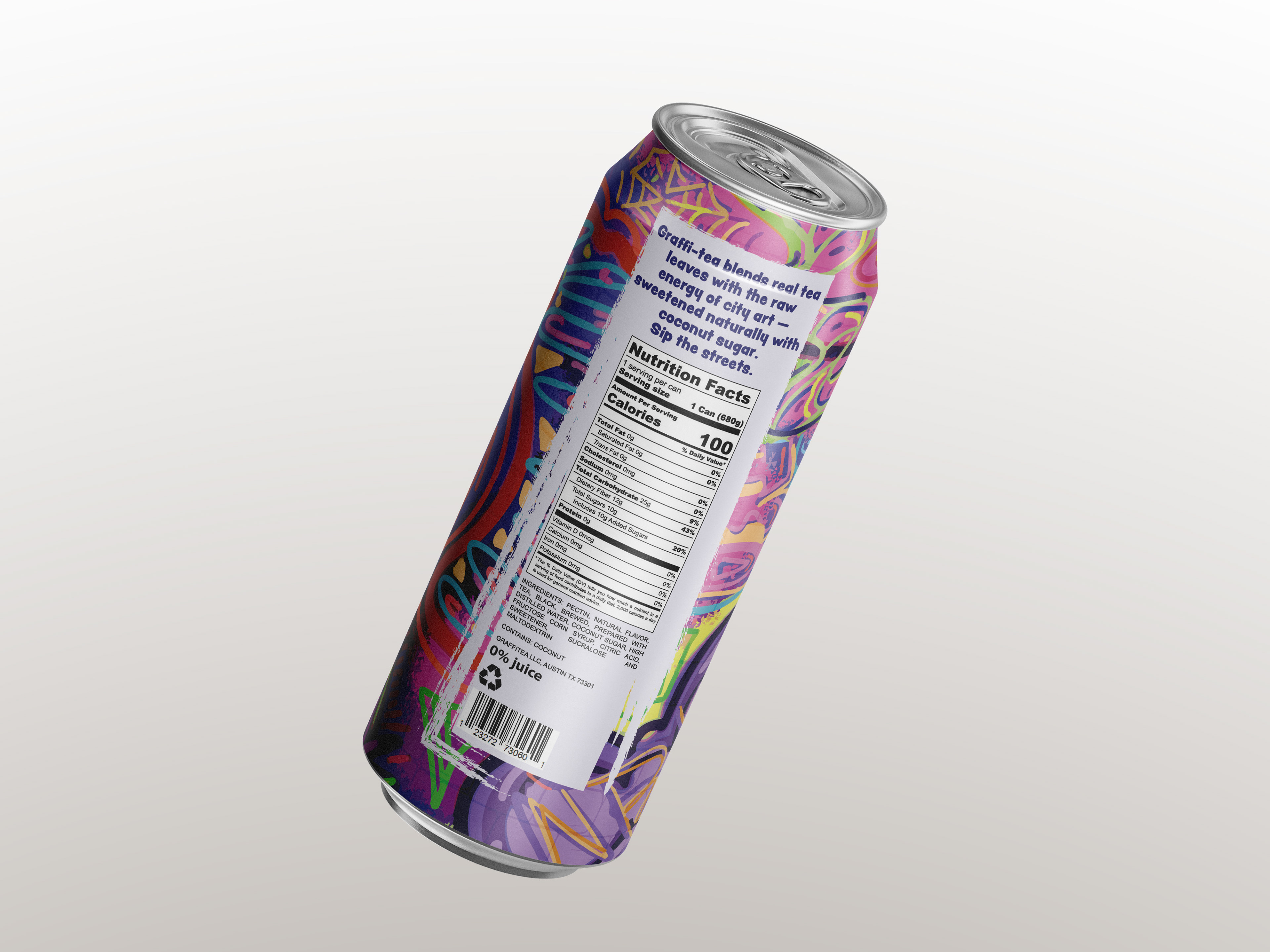
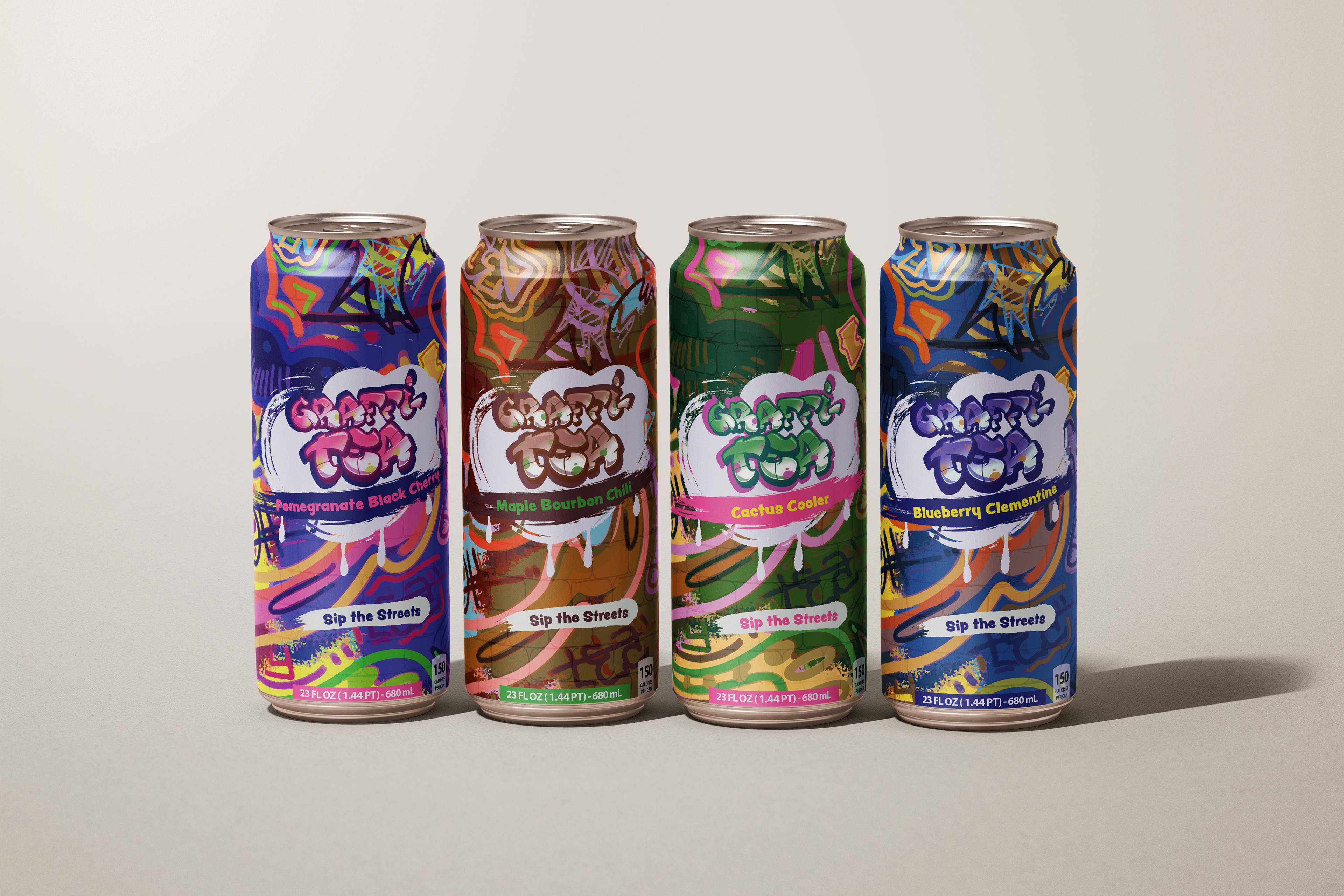
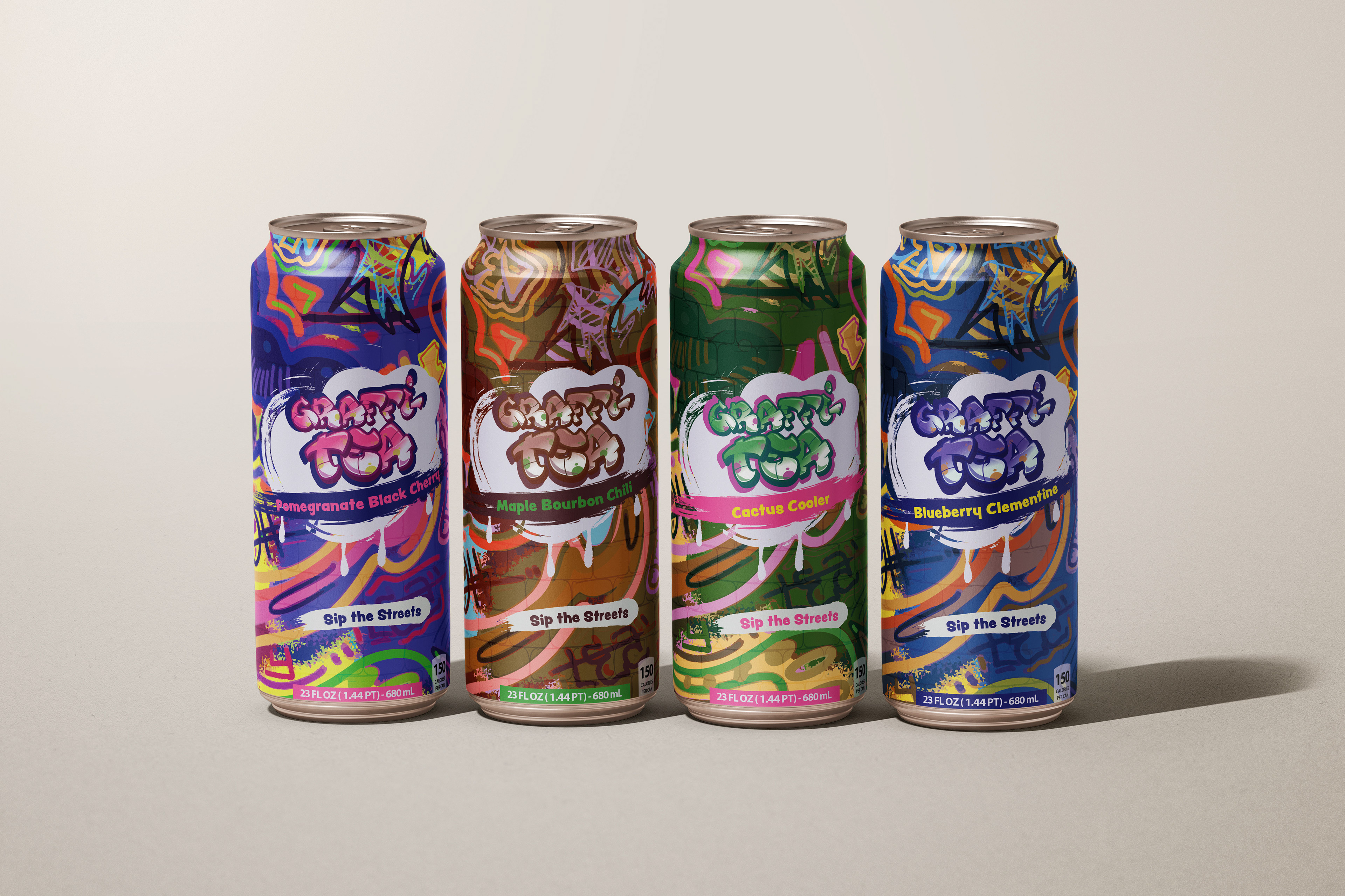
Final
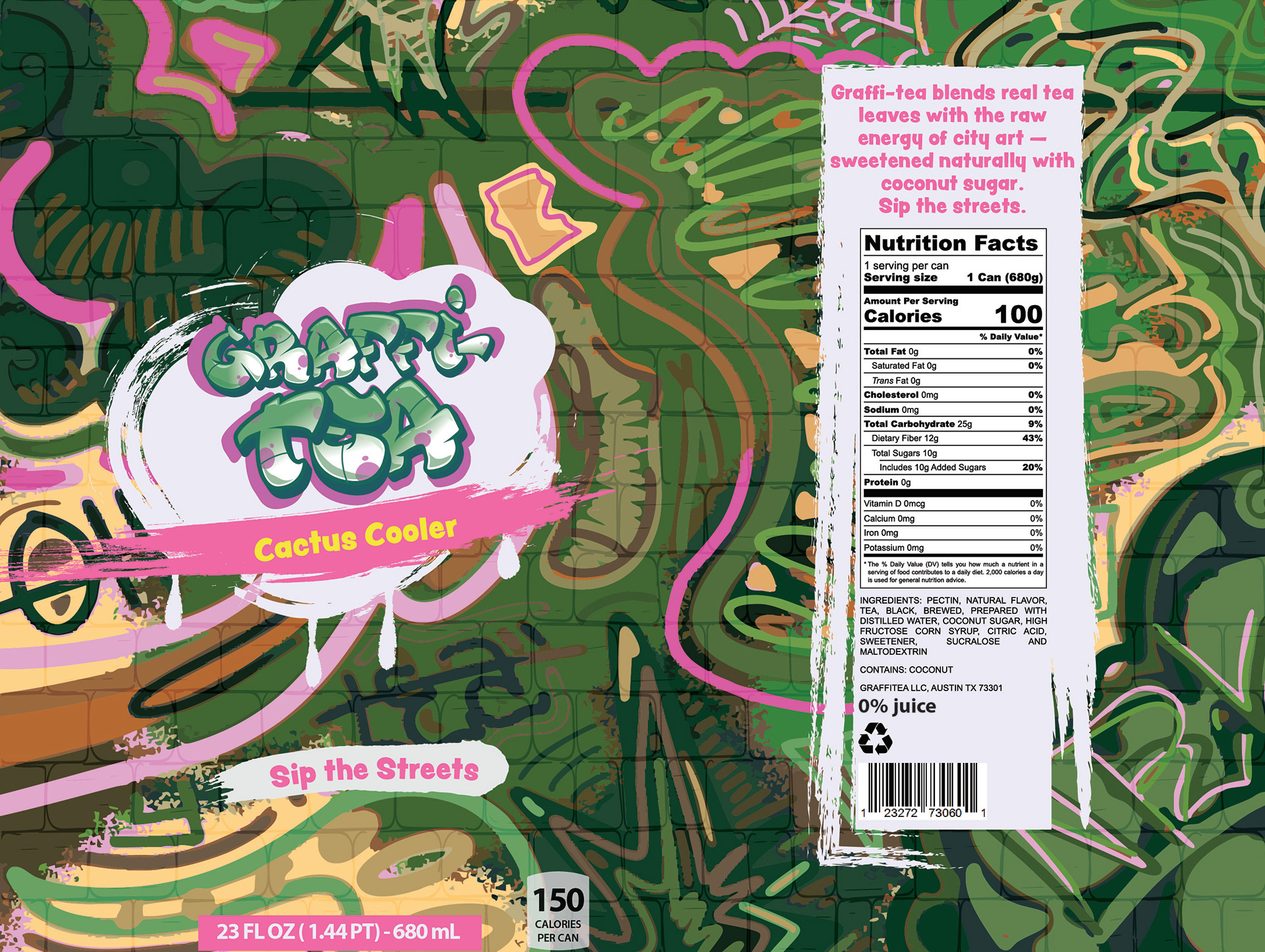
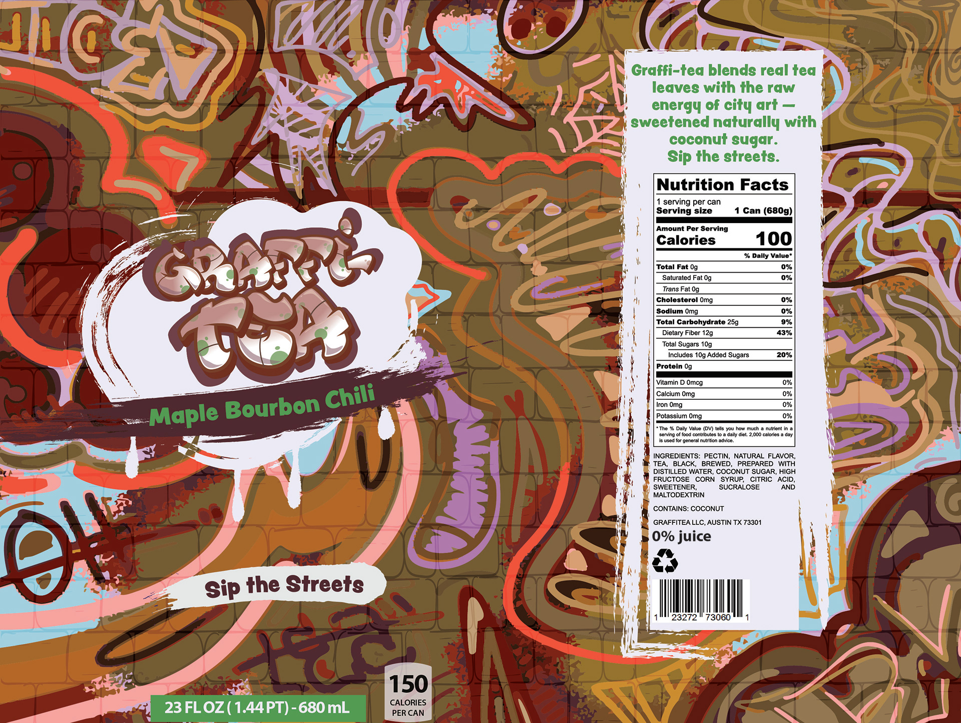
The logo felt too small, so I made the “Tea” much larger and placed it underneath, which helped use the space more effectively. I also added a short story blurb to make the brand feel more personal and to give customers a sense of the drink. The net weight was moved to the bottom of the can and centered under the logo so it’s more visible when front-facing. I then created three additional unique flavors to complement the first and round out the brand.