This school project is to create a booklet about the life of a graphic designer of your choice, and I chose Laszlo Moholy-Nagy. I like his work in particular because of how diverse it is, and how he took photography and combined it with his other areas of study. We had to do our own research to create all the copy for this booklet and make sure that it had a specific word count so as not to go overboard with the words.
Moodboard
I did multiple moodboards and settled on a style that showcases the bulk of his work, featuring black and white photomontages and colorful geometric paintings. Due to his work in the Bauhaus, I picked some fonts that reflected the time period and were inspired by the work that happened there.
Sketches
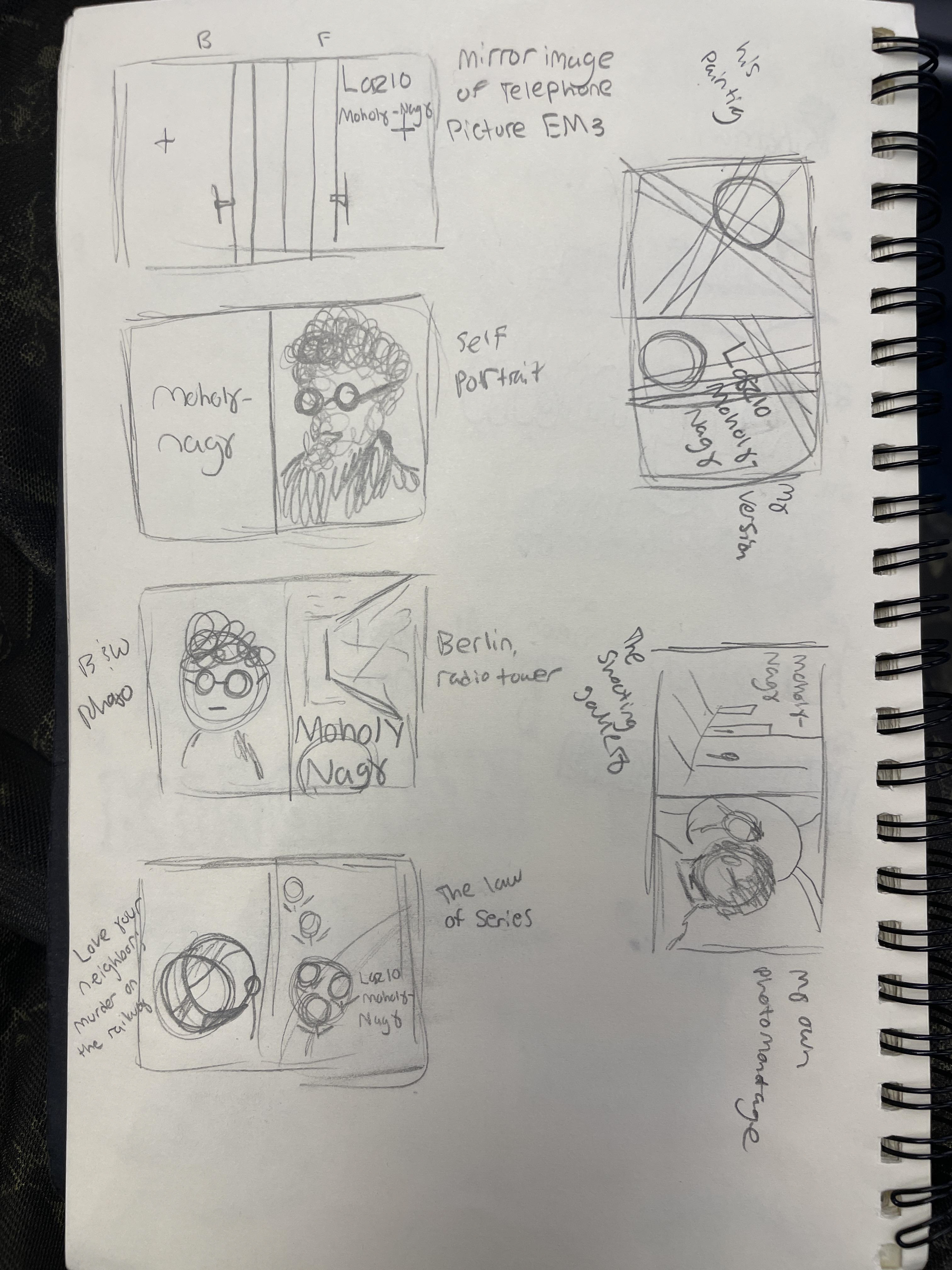
I did simple sketches of the front and back covers, most of which used work that he has done as a feature. For the interior spread sketches, I also created basic wireframes, but I redrew some rudimentary copies of a couple of his pieces and framed the text around them.

Cover Sketches

Interior Sketches
Cover Drafts
I turned almost all of my cover sketches into basic digital drafts. For the black-and-white cover, I attempted to emulate his photomontage style by using a photo of him. In contrast, the back of the cover actually features one of his original photomontages of a shooting gallery. Both beige covers utilize his existing work, with his name set in one of the fonts I selected on the mood board. For the cover with the red stripes, I created my own variation for the front and used his original version on the back.
Interior Drafts
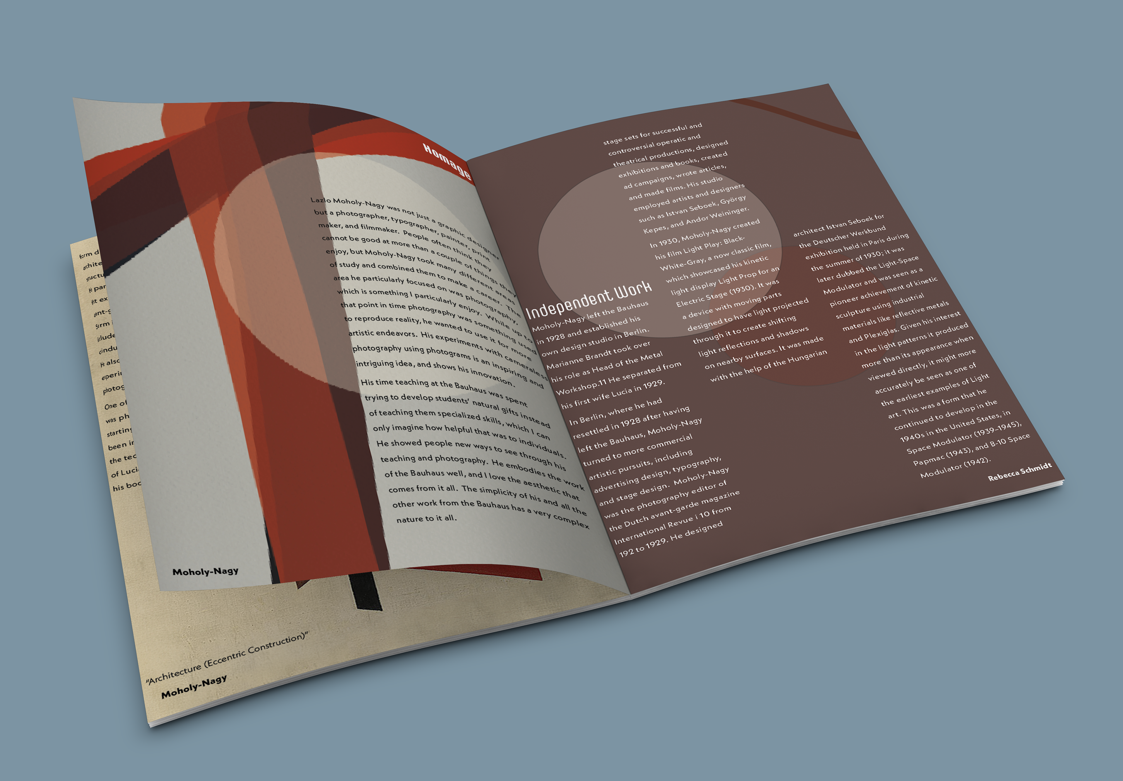
For the first interior drafts, I basically recreated my sketches, either placing images of his work or centering the text around the lines in his pieces. I also tried layouts inspired by his style, using my own lines and circles and framing the text within them. I ultimately chose not to use my variation of his red line piece on the cover and placed it inside the book instead, labeling it as a homage.
Final
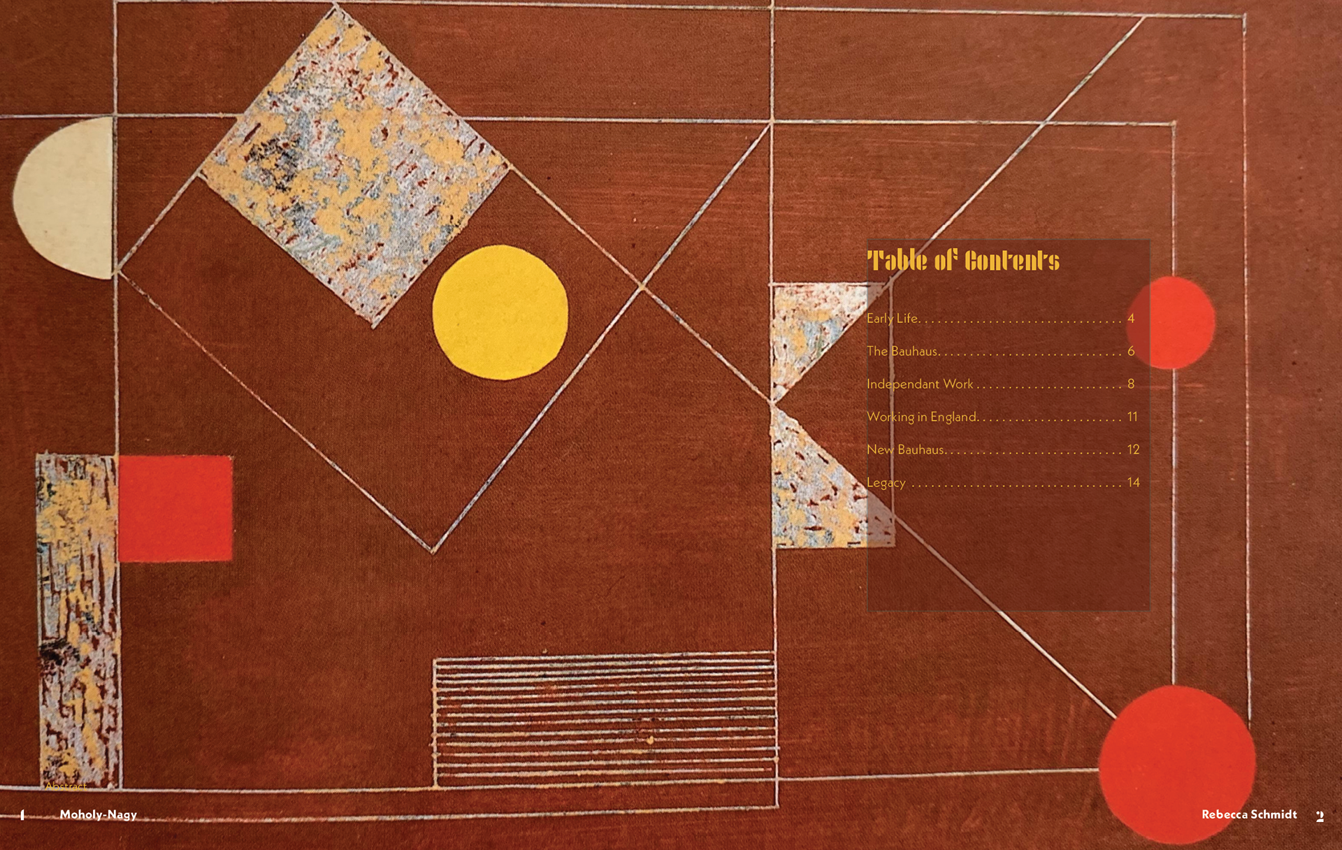
I added a few more pages to replicate this style and selected more of his work using lines and geometric shapes. I changed some of the shapes on the cover to make it feel a little more like the back and added a splash of color to the back in the form of a red polygon.

Front Cover

Table of Contents


Back Cover
Overall, this was a challenging project, but I can say the previous
projects I did with a magazine gave me some good experience that helped this project flow smoothly. Even though this was not meant to look like a magazine, coming up with layouts and working with a lot of type was something I was already familiar with.
projects I did with a magazine gave me some good experience that helped this project flow smoothly. Even though this was not meant to look like a magazine, coming up with layouts and working with a lot of type was something I was already familiar with.


